Pages

Saturday, May 18, 2013

Cartoon Art Museum

The Chefville art team (That's the team I'm on)  was given the go ahead to do an offsite and visit the Yerba Buena Museum. While that was a pretty cool museum, after that, we all decided we wanted to hit up the Cartoon Art Museum that was a couple blocks away. And of course, I had a blast in there!


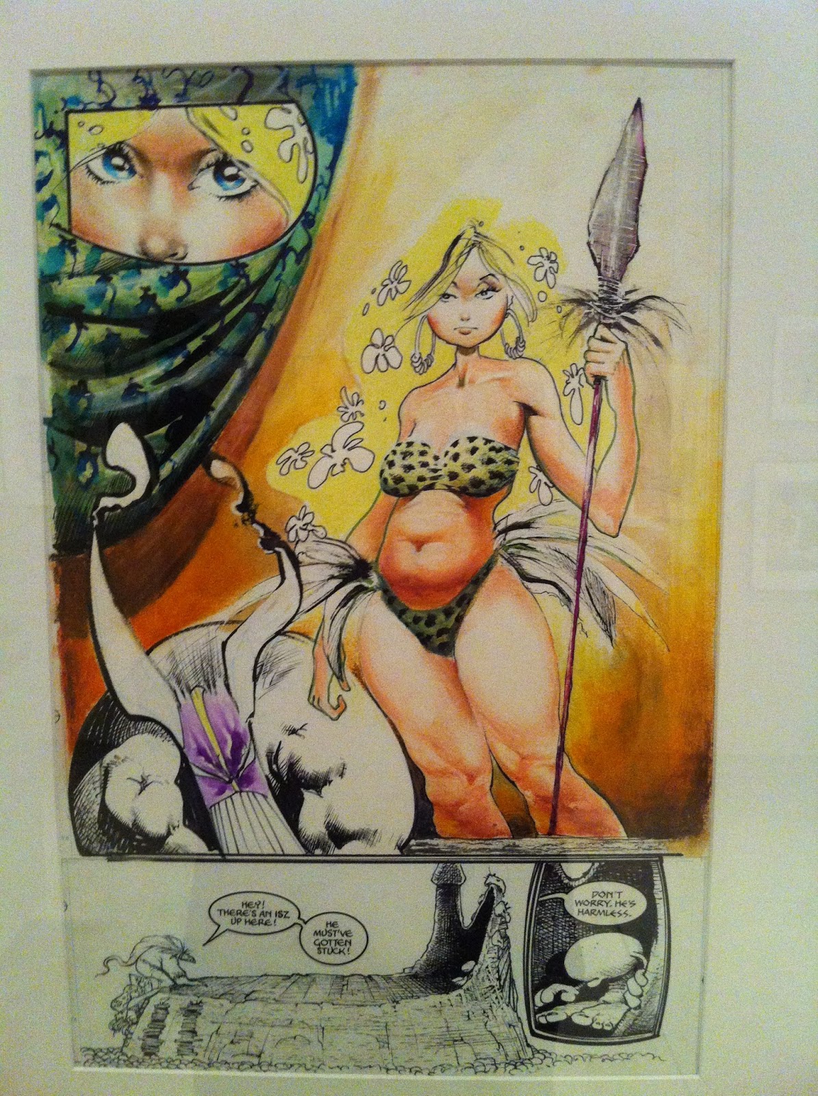
At the time we visited, they had a Sam Kieth exhibit up. It was nice to see his stuff up close. It's interesting, because I have a few books with his art in it, but somehow I just never appreciated it as much as I did when I saw his actual art. Don't get me wrong, I like his stuff, but seeing it in person is certainly something else.


I have a few issues of the Maxx, but you never quite see the
energy he puts in applying the paints with the printed material.


This is a close up of a two page spread. I love the hatchwork he used in the face.
Always good to see inkwork at actual size.
Nice use of solid blacks and hatching to give a nice range of tones.

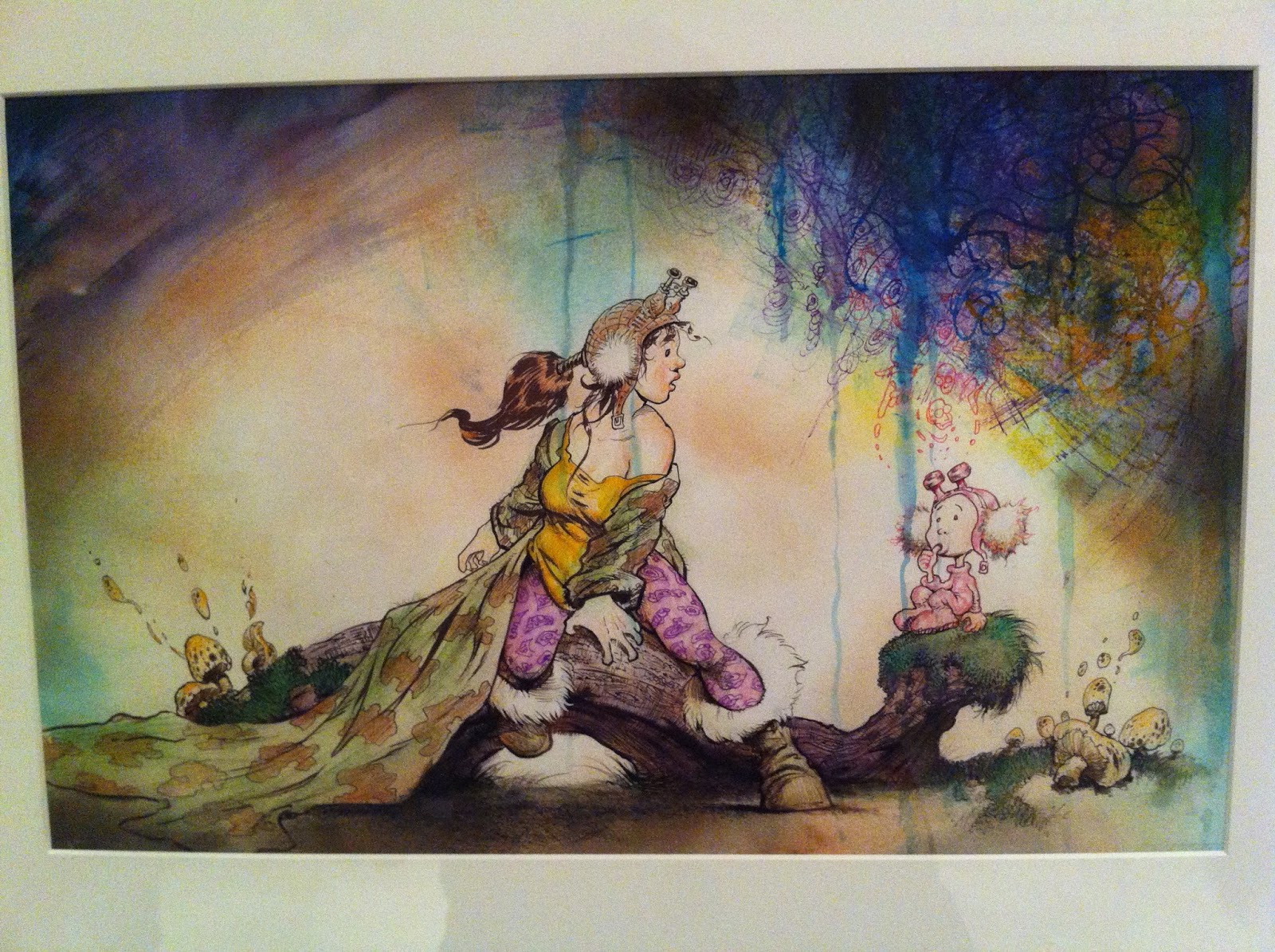
There's a lot of texture going on in this painted piece.
I think it's his personal work, but I'm not sure.  Creepy cool.
In the rear of gallery they have a few of the permanent pieces (at least I think they are) on exhibit. It was a nice collection of some great work. It's very interesting to see some of the newspaper strips up, and just thinking about it from a production standpoint makes me appreciate it even more. Like for instance, the economy of line, the set up and the punchline (for the gag strips), all within 3 panels, and the stress involved to deliver the work at a daily pace. And of course, it also has to be good!

Walt Kelly's Pogo strip original inks. His lineweight and hatchwork is killer.

Hal Foster's thumbnails for a Prince Valiant strip. Great to see this part of
the production before he goes into the final piece. Even his 'people blobs' on
panel 3 look great!

I have always wanted to be able to create a rogues gallery as awesome as Dick Tracy's.
Chester Gould had that best character designs. It may have been for a deadline, but I love seeing giant
spots of black on a page. It just makes inks look so much 'fuller'. Look at how giant that text is for legibility!

I always read Blondie when I was a kid and I think I watched
the live action black and white re-runs on TV too. I always did wonder why
Blondie married that goof Dagwood Bumstead! And he's just being mean in this strip!

Always great to see a Will Eisner original. Loved the shadow of the
glass signage casting itself on the Comissioner Dolan's trenchcoat.

I vaguely remember reading these in a collected edition in a
library in a golf club in Alabang, Philippines. I remember liking the
art for Alley Oop, but I cannot remember anything that happened in the strips!

I have no idea why, but it's only when I saw this panel from
George Herriman's Krazy Kat did I realize that that's the style
Art Spiegelman was going for in Maus. Or maybe I did know, I just forgot? 

I loved seeing this color guide.
A bit blurry. I've never seen a Watterson original before this.

Detail of the watercolor work he did for the cover. Very clean application
and such nice subtle shifts in color. I always  loved his choice of colors.
And way in the back of the museum, there's a looney tunes/ Chuck Jones exhibit. And looking at some of his stuff certainly makes you feel very small as an artist!


Detail of the gradient of the light on the floor
applied in Guache. Pretty awesome craftsmanship. I
REALLY sucked at Guache in school so I really feel
super, super tiny when seeing how great it's applied in this piece.
This is a great sketch.


And finally in the main gallery, there's a few contemporary artists pieces being displayed for limited time as well. One of the artists in it, Roman Muradov, I've actually bought one of his comic books at some store in Japantown during a festival. I think he was the one who actually sold me the book, but I wasn't expecting anything when I flipped through his book. Anyhow, my mind was blown! His stuff is great.

A piece by Roman Muradov.
I've actually been seeing his comic books all around town (In San Francisco) on the indy racks in comic book shops as well, as I'm trying to figure out local places that can carry my books.

I See what you Say by Christian Robinson.

Sadly, I cannot remember the title or the artist
of this piece, but I dug the colors and the shapes of the animals.

Elenor Davis' Talk to ME, Not to My Daughter. I'm
always a sucker for a  nicely applied complimentary color scheme.
Uhhh, look no further than this Blog's header image to see what I mean!

A splash page by Eleanor Davis with Drew Weing.
This is from the Secret Science Alliance and the
Copycat Crook. I'm going to have to pick up a copy of this book!

Aaron Reiner's A Strange Storm from Night of the
Waxing Moon. Sorry it's blurry. I can't seem to find this book on Amazon or
Instocktrades for order? Maybe I have the title wrong. Looks great nonetheless.
 And finally, in the room next to that gallery, the room was blocked off, but I saw this:


Noooooooooo!!!!! The Superman exhibit wasn't up yet! Gah! Apparently it's up NOW. I'll have to make the pilgrimage there sometime next month for Supes' birthday.

And that it for tonight in San Francisco. good night and God Bless. The Neverending battle will continue!

Sunday, May 05, 2013

Free Comic Book Day and Superman: Unbound

Free Comic Book Day has come and gone, and I was able to take my daughter to her very first one over at Two Cats in West Portal, San Francisco. It's not my regular Comic shop but it's close by and easy for me to get to. A buddy of mine lives close too, and since it's been hard to meet up with him B.C. (Before Child) it seemed like a good place to go.

The store was pretty packed, and not quite as many kids as I thought were there (just old nerds like me). I saw some kids come in, but they didn't really know what to get. I think Spongebob was the closest property they knew, but one of them didn't really know what the Ninja Turtles were (which is odd since they just relaunched). They definitely had no idea what the smurfs were.

I always wonder, with kids that are soaked in TV and ipads all day, how do I make a comic book worth their time to actually sit down and read? How do I compete with something like that with my own comic?

Here's the swag I decided to pick up. Only one of them is from the official FCBD line and the other two are extras from their stock:


I haven't read all of them yet, but I finished Batman Inc #1. I've never been a fan of Grant Morrison's stuff, but maybe because the stuff I read from him isn't usually a Batman comic most of the time. All-star superman may be the only exception of a title that he did that isn't Batman, that I liked.

Anyhow, it's a good issue that is tied very much to the initial series before new 52 (I got all of them when the price was lowered to 99c each digitally and it's a good read). So that was a score of a freebie. I'll probably wait for the trade to come out the get the rest. To newcomers, it might be a lot confusing to jump into this without reading the first series.

I just started reading through the first few pager of The Strangers, but I'm already a little distracted by the story telling. Some of the panels and layouts of the scene I wish were a little clearer in that opening action sequence, but I still 'get' the flow, so no harm done.

I haven't read through Fantastic Four 600 (SPOILERS! I believe the Human torch comes back in this issue), but it's a beast of a book 100 pages! I couldn't resist grabbing it.

Okay, switching topics now!

I recently watched Superman: Unbound, Warners' new animated feature featuring the man-taking-over-Bruce-Timm's-shoes James Tucker directing it. I really liked Tucker's work on the Batman: Brave and the Bold series so I had hopes for this movie as well as Tucker handling the producer roles that Timm did.

Okay some spoilers follow, but not really giant plot spoilers... be warned!

On my first viewing of Superman: Unbound there were some story bits that nagged at me. Little things here and there, such as Lois' character in the way she pressures Clark about their relationship, or getting angry at Clark for getting back at Lombard. The language Superman uses (I guess I'm kinda old fashioned and I never want to hear Superman say: "Go to Hell", Lois flippin' the bird and an odd decision Superman makes when battling Brainiac. Oh, and some weird thing going on with Superman's placement when Brianic shoot a beam from his Brainy-ship.

However, I find I've been relentlessly watching this movie over and over and over. Especially having it on while I'm working, and I must say it's really growing on me. The things about the plot that nag me are still there, but for some reason I forgive it more. Lois flipping the bird is actually what Lois would do, and seeing Lois and Clark argue like a couple is a fairly unique decision that we don't really see often. I didn't realize that the movie is PG-13 so it's not aimed at kids but rather teens. So while I have my qualms about the movie I think it's still a good approach.


The movie also changes a few things from the original run (which I re-read after my second viewing of the movie). In my opinion, Geoff John's original arc is better. I can see why they would change the ending (kinda), but I thought it was a very good way to really show just how formidable of a foe Brainiac could be. The odd decision that superman does while battling Brainiac on his ship in the movie, doesn't exist in the Geoff Johns story and there's also a cleaner solution to how the plot progresses. Also the Lois and Clark dynamic is handled much better, with Lois actually being VERY cool when Clark is pranking Lombard back. Oh and Johns is able to flesh out the supporting daily planet people much better than the movie does.

The movie also has a lot more Supergirl and a lot more of Superman getting whupped down. If anything Supergirl seems like a stronger hero than Supes (and that's not a big deal to me but when you name a movie SUPERMAN: unbound it'd be cool to see him be a little more kick butty).

The voice casting and acting is excellent, and Matt Boomer does a great Superman. I really dig the character designs and Superman and Supergirl look great in the film. The color choices (Krypton's especially) and the action sequences are a lot of fun. Supergirl is a great character in this film. She's the angsty new 52 Supergirl, but they really make her work well in the film and you understand just how she is her own person apart from Superman. There's also a little Lois/Supergirl 1 on 1 that's played well.

I still think Superman vs. the Elite may be my favorite Superman WB Movie. That story had good superman elements in it and sucked me in enough that I didn't have time to question the plot progression that Unbound did. However, I tend to lean towards the art direction of this movie more than that one.

Still, a good movie all in all, and it must be doing something right if I keep watching it over and over, right?

I'm saving up for next month, on Supes' 75th anniversary. I think I'm going to go all fanboy and buy a lot of superman paraphernalia! Okay that's it! 

Up, up and away!

Wednesday, April 10, 2013

A Super Break: Getting ready for his 75th!

Life has been nutty recently: just a lot more of it and a lot less time for myself... or too tired to draw when I do get some time! Whatever! Suck it up Bautista! Let's get to this post!

Superman's 75th anniversary is this year (and coming up in something like 2 months?), so I wanted to draw a pin-up for it. At the rate I'm drawing and posting, I KNEW I had to get started on this early. In general, I've been practicing on drawing Supes for awhile so this pin-up kinda reaches way back I suppose.

I started sketching out Superman's face. Trying to get a feel for it, until I come up with something satisfactory. And while other artists just get their doodles out perfectly, I am quite the opposite, almost all the time. Nothing comes out looking remotely great. I call it pooping on paper.


There's no possible way I can get it right the first time. So to work around that, I just draw a bunch of drawings (poop!), hoping that with each iteration (pooop!), I'll get close (poop poop!). I never really get THE one perfect drawing... Just get maybe real close, so it's not sa horrible mess! Sorry for the gross analogy, but after having a baby, anything related to poop is totally normal.

Once I'm close with his face, I start to work on his pose. It's the same process, a lot of misses but, at least for me, very necessary. Here's a digital sketch of me trying to still figure out his face and just pushing forward with a pose even though I hadn't worked it out yet.


So that was a sketch pose start and fail. However, I think the look of his face was coming along further this time around. I go back to the drawing board and start sketching more poses.


I liked how that bottom right corner one looked, so I decided to start fleshing that out in photoshop.


I tightened up the details of his arm a little in the sketch. Then started to ink and make up the details along the way. I put him in his new 52 outfit. And to tell you the truth, I think it's actually growing on me, lines and high collar and everything!

Supes Saluting and looking off to the right. At what? At this point I didn't really know...
After the inks, I started thinking about what background to put and instantly Superman flying in space popped into my head. So I googled up some earth in space pictures and proceeded to try working it into the image. However, I found after adding the blackness of space behind him, that element didn't seem to work. Also Superman always struck me as a brighter, daytime character anyway, so I decided to change it a bit.


I added some basic colors that were pretty bright. And I was messing around with some effects for the sky.


The sun rays weren't quite working but there's something about the beams that I initially liked. The straight angled sun rays seemed to compete against the curvy background. I switched it to be more like speed lines that went with the curve.


That's where I am so far. My final post for this won't probably be until June, in time for Supes' birthday. That's it for tonight! I am TIRED! Good night and God Bless!

Sunday, February 24, 2013

My Comic Book: Issue 3 Page 7 WIP


It's amazing how long that second panel took me to draw. Considering I already had a tight sketch of the kid already done, it really bothered me that I couldn't just finish it. Knowing that I wanted a lot of overlapping dialogue in this panel, I did the balloon layouts first.

However, I flip-flopped and kept changing the dialogue so many times, I just spent an eternity (at least it felt like it) getting those balloons laid out. I changed the top panel a little to make sure I could place word balloons in them too.

Well I guess I can also add in the fact that my wife had the flu for a week, so I was taking care of the baby all week, so that was tough. I took a few days off  to do so, but it's not really a vacation I'll tell you that! In between baby naps, I'd try to work on this page, hoping to finish it within the week, but I was so writers'/artists' blocked the whole time and distracted, it was pretty agonizing.

Anyway, I'd better sleep now, I'm back to work tomorrow, and I'm pretty sure my baby will be up early again!

Tuesday, February 19, 2013

My Comic Book: Issue 3 page 6 Final inks (again!)


NOW page six is finally inked, and I made sure not to overwrite the file this time around! I also added and cleaned up some dialogue quirks that were there before. I noticed I repeated Bomb girl saying "though" after her sentences in the previous version. I also didn't bother drawing any of the stuff behind the word balloons, and just drew what would be seen.

I remember reading a Kevin Nowlan interview where he talked about laying out the word balloons first, before any actual drawing took place on the page. I noticed on this second pass I futzed around that last panel a lot less once I noticed that the word balloons covered up a lot more of the drawing. Definitely something I need to keep in mind more so I can be a lot more efficient!

Friday, February 08, 2013

My Comic Book: Issue 3 page 7 WIP and page 6 re-do

It's like deja vu except all over again! Finished re-tracing the first 4 panels of my botched-save page 6:

It's definitely faster the second time!
A little progress on this page
 I have to admit just inking pages tonight and not dealing with layouts at the same time was quite relaxing. Tomorrow I'll try to finish off the last panel of page 6.

And that's all I got! Good morning and God Bless!

Wednesday, February 06, 2013

My Comic Book: Issue 3 Page 7 and some dumbness

Well, I just did something totally stupid.

When I start a new page, I usually use the previous page as a template; it's already got existing panels, lettering, and guidelines. I usually open it up then save out the same file as the next page, then start working.

In my lame-brained moment, I forgot to save out the file as the next iteration. So instead I saved OVER the old page (page 6) and totally lost all my work. Almost all of it except for what I posted up online. I can recover the page still and I've definitely gotten hit by worse, but it does nag at me that I pulled such a rookie mistake! Gah!

Strangely I'm not TOO angry at myself. Yet. Wait 'til I start re-tracing that page all over again...

Anyhow, I got a teeny bit of work done tonight. My thumbnails are, again, very rough, but this time around even though I haven't even finished the layouts, I've already started attacking the page. Probably not a good idea, but I just wanted to get this page movin'.

Rough unfinished layout for page 7 and a little bit of the script

not sure if the panel divisions will stay the same for the 2nd and 3rd tiers
 I really cannot believe I overwrote my file for page 6, after all that time I spent on it lat week! I must still be tired... sigh...

Friday, February 01, 2013

My Comic Book: Issue 3 Page 6 final B&W

Okay! Finished up the lettering and time to move onto the next page! I think these late nights + early mornings are starting to take their toll, so I might take it easy this weekend.

Not much of a football/superbowl fan, so maybe I'll try to lay out the next page a little better than my initial thumbnails. for it. That thumbnail is literally blank squares with scribbles of a script around it!


 Sleepy...

Thursday, January 31, 2013

My Comic Book: Issue 3 page 6 WIP part 5

That last panel got a little more detailed than usual, but I think I can still keep it focused with color later on.

Okay, onto lettering!

Wednesday, January 30, 2013

My Comic Book: Issue 3 Page 6 WIP part 4

I'm getting REEEAAAL close to finishing up this page. I just need to add people in the seats and some more tweaking with the line-weight and minor corrections and it's onto the letting part. The layout of the last panel might be an issue with the word balloons I have planned for it, but let's figure that out when we get there (totally not the thing to do but hey).


Did a few cheats and hid some things with the addition of the blacks into the page, but that right side of  panel 5 is feeling a little cramped when I add detail to it (like seats) so I left it a little bare but filled in with black. I might put a line in there on my next pass to break up how solid black it is.

I think I'm just rambling now, I'd better hit the hay. My daughter isn't sleeping too well (growth spurt, we think) so I'm pretty sure I'm going to pay for it staying up this late...

God Bless and good nigh... morning! Sigh.

Tuesday, January 29, 2013

My Comic Book: Issue 3, Page 6 WIP part 3

Did I say a panel a day on that last post? Maybe I meant a couple hours of distracted work a day...
This panel's angle was a little funky for me to try to figure out. The faked perspective wasn't quite working, so I spent some time drawing and re-drawing perspective lines.

Still needs some futzing to get it working...
After awhile of getting nowhere, I went to the trusty internets... my gigantic personal photo reference resource. I picked a shot where I had to fake the interior, since actual airline aisles are REALLY narrow. So I took out a couple rows of seats to make the cramped establishing shot in panel 5 kinda work.

Anyway, I am going to be late for work again if I keep this up! Maybe later tonight I'll have better luck finishing it off!

Sunday, January 27, 2013

My Comic Book: Issue 3 Page 6 WIP part 2

So my motto for the moment is: "A panel a day, keeps the deadline away". Or something like that. So the idea is to try to finish a panel everyday. Honestly, just typing that out makes me feel like it's crazy, but we'll see if I can keep that up.

Trying to spot more blacks in this issue.
Maybe in my swingin', reclusive, bachelor days I could pop more than a panel in a day after work. But with my responsibilities at home with the wife and baby and house chores (which I am naturally horrible at already), I'm usually brain-dead by the end of the day. But I need to push!

I'm trying to spot more blacks into my pages for this issue compared to issue 2. The second issue I relied a lot on colors to bring out contrast in my pages. In the first issue, I think because I was still doing that traditionally, I worked on the black and white stages longer, so I was more concerned with how that looked first before I moved onto the coloring stage.

But with my switch to digital, I'm moving onto the coloring stage quickly (like the last two pages). Color is good however for my target market, bright and bold appeals more to kids. However, I do love high contrast black and white artwork. While I'm not planning to go all Hellboy on the art, maybe I can find a happy medium.

Wondercon this year is apparently not going to be in San Francisco, so there go my chances of trying to get a table there (since I hoped it's be in SF to keep it local). The A.P.E. expo, however, should still be around here towards the latter half of the year. So it still gives me sometime to finish up this issue and hopefully have 3 issues to sell there, as well as some art books. Well I gotta get a table at A.P.E. first, but that might be tough.

Time to hit the hay! Good night and God Bless!

Saturday, January 26, 2013

2nd Wedding anniversary

I have been sick three times since Christmas. It's been really annoying since I'm the only one that seems to be getting sick in the family (which is a good thing, but the wife and have been kid playing keep away all this time!). I guess I'm still recovering up until now. The wife is taking every precaution so the Baby doesn't get sick from me since she had a milder form of pneumonia during the holidays.

Anyhow, how does me getting sick relate to anything in this post? Well, I drew up a card for my 2nd wedding anniversary without telling the missus. And I was still sick and going to work (shhh, don't tell the co-workers) while this was going on. So let's just say something this simple was pretty tough.

I drew up a rough sketch of it at work in between rendering frames and backing up some work files. Oh yeah on top of this too, the project I was on got cancelled, so everything was in transition for me.

What large heads you have!
I had the idea in my head already, and I kinda did a similar process for the gags in my proposal comic book. I planned to use the same pose and simply put new clothes on the characters. It's fast, cheap and works for the gag.

I broke up the actual final work into two parts. One session I think I had 2 hours to work on it, then the next was 4 hours. Only 6 hours of work, but I was pretty tired and mighty distracted. I actually think I should've been able to do it faster, but there was a lot of figuring out as I drew.

Happy ANNIVERSAY hey hey hey!

What you see here is the 'fixed' version. I guess I was so out of it, I initially spelled 'Anniversary' as 'Anniversay' on the final printed card! And my wife posted it up on Facebook too, so my spelling prowess is up for the world to see! Ah well, can't win 'em all.

There are a few things about the drawing the bug me, but it got the job done. The wife gave a good laugh and said I really got her look with the drawing. And that's really the kind of reaction I wanted when I set out to do this card. Anyhow, that's it for tonight, Good night and God Bless.

Monday, January 21, 2013

My Comic Book: Issue 3 Page 6 WIP

I cut up some of the panels I have all over my sketch book to get the layouts for page 6 down. So here's a sample page from my sketchbook. I write all sorts of scripting details whenever it hits me, and I'll sometimes try to figure out the composition for the page and layout in a disjointed order.

I tend not to scan the original that large, since it's just for a rough anyways, Sorry if it's blurry.
Then I arrange the panels I like onto a page that already has borders and margins. I then create the frames for the panels. For this page, I decide to add an extra panel (the fourth one) during this phase, but I never really planned it in the early stages.

The thing is, I work really loose, even to the layouts as I go to final. And frankly even as I'm 'inking' I tend to cut up stuff and re-paste all the time. Since everything is digital, there really should be no fear of experimentation or moving things around even at the 'final' stage. I've actually cut up things even when they were all colored up already...
I remember wanting to add another panel on the top tier, but figured three could get it done just fine, less cluttered.
I was just going to leave the layout stage as my work for the day, but again because it's all digital, it's really easy to dive into the final inks. Plus, the characters I designed are purposely simple. I tend to overwork things and over think things and it always leaves me stuck. So, with characters this simple, I can move faster on the drawing and I can concentrate more on the storytelling (and just having fun).


That's it for today! It's my Anniversary tomorrow, so I might have a slightly different art post tomorrow! The Neverending Battle continues!

Tuesday, January 08, 2013

My Comic Book: Page 5 Final-ish

I think this page is all done. I went back in and fixed up the first two panels. The character was still off model. For this pass I added in the word balloons. I've said it before, but once word balloons are added to a page, it just feels great (for me). Like my page and story start coming alive.

Maybe because I also tend to edit dialogue a bit from when I first jot them in my sketchbook, as I'm lettering. Anyway, that's it for this page. Good night!

Sunday, January 06, 2013

My Comic Book: Page 5 Work In Progress

Okay! I got some random hours during this weekend (inbetween baby-naps, burps and diapers) and I got to work on my comic again. I've been sketching roughs of the pages of my book during lunch at work. Sometimes I skip around and draw pages, and even panels out of order. I scanned a few pages from my sketchbook and pieced together the panels of this page.

Not a very difficult page really, so a good one to ease back into working on the book. I initially drew the doctor in panels one and two off-model since it's been awhile, but the colors and ink work are all done.

I have to go back and letter it just to see if my layouts work, then it should be all done. That's it for tonight! Good night and God Bless!

Monday, December 31, 2012

In 80 dates

Quick post for tonight as well as the last post of 2012 for me!

A friend of mine has been drawing up some 1 panel comics dealing with the 'adventures' of dating. It's light hearted fun that takes from her and her friends' dates, but when you read through them, you'll find more than a few that I'm sure you've been on before (the female version of Date 11, for me sticks, out in my mind the most). Head over Approaching the issue in 80 dates to check it out and I also have it in my links section.

Anyhow, to show my support as well to thank her for the great blanket she made for my daughter for Christmas, this post is dedicated to her! Complete with fan-art! (And of course, it will be complete with the neverending battle process-post.)

So first off I do a quick sketch. I went through her website and picked which character I wanted to draw. At the same time that I was composing the image I was also trying to figure out how to draw her characters. Truth be told, I just went right into the final inking phase without really figuring out 'my style' for them, but it worked out in the end.

working fast and furious on the sketch phase. I kept it loose to get my idea down quick. A little too loose maybe...

In the inking phase, I started filling in blacks, which among other things I did strays from the style of the comic, since there are no heavy black areas. I figure I can solve it later in the coloring stage. It was kinda tough since I had to go through the website again on the inking phase, because my sketch phase wasn't very tight. I was very loose, so certain details like what characters were wearing aren't in the sketch.

something very cool occurred to me as I was drawing these characters: essentially they have the same face, but there's a lot of attention on their hair that really sets each person apart from one another. 
Next up, I add colors. Here's where I REALLY break the art direction that's been set (and hopefully she won't hate me for going completely off-model!). I still kept in mind how she worked the colors in the original strip. My natural Bomb Squad coloring tendency is to add shadows to help pop out characters from each other. However, the original strip's style is simple, but specifically chosen shades of gray for the colors. It was very tough not to rely on my old coloring tricks, since every character was on top of everyone else in my comp.

I have a version where I don't use a color fill for the black inks and it looks pretty cool too, but I think the purple fill on the line work helps connect it better to the original strip.

Approaching the Issue in 80 dates gets superhero-ey!
And that's it for me! Go check out my friend's website and read through it already!

Saturday, December 08, 2012

ESWAT

Still haven't gotten into the flow of working on my third issue...  My daughter, my wife and I are all sick, my hotmail account (which I haven't used in years) has been hacked, and all my yahoo email and contact info has been deleted. Also, my portable hard drive with a lot of my professional work has been messed up, so I can't access it.

I've gotten lazy and in between taking care of the baby, the wife and myself I've been doing hard core video game time with Sonic Racing Transformed and Mighty Switch Force on the Wii U and Bayonetta on Xbox.

Suffice to say, I haven't been working on my stuff.

However, since my last post was about shinobi, I thought to throw up some more old-school gaming art from the archives...
Now that I think about it, this dude is kinda like a mature Mega Man...
E.S.W.A.T. was my system seller for the Sega Mega Drive (Sega Genesis, whatever). I think it came with an Altered Beast pack-in (which was still all the rage back then and I also really liked), but I asked if I could swap it out with this awesome game. I think I played it at a friend's place and I really, REALLY liked it. I would go to a friends house and played all sorts of multiplayer games, so I doubt we played ESWAT much. But it made quite an impression!

I remember these sliding dudes were a pain in the butt!
The game has an arcade counterpart, but plays totally different. The home version was more like a shinobi game and had two levels where you didn't have any armor: you were just a normal cop. The difficulty was pretty hard, but it was a lot of fun. My hardcore gaming muscles have atrophied what with all the continues and save points these newfangled games have nowadays, I doubt I could hang with it anymore. I DO fondly remember towards the end the suit gets an awesome power up and you can unleashed this super attack that had you spin in place firing a GIANT laser from your arm (which overheated your suit, so it'd be a move you can't always do) destroying everything! Fun stuff.

This was a blast to mock-up. The foreground buildings were built by a coworker then I painted over it  and drew a lot of the background,scaffolding, and glow effect-y things.
Life was a lot simpler then! The Mega Drive box art for this was awesome, I remember, and googling it up shows that it still is as awesome as I remember! Anyway, that's enough nostalgia for the day!

The neverending battle (in my body and mind!) continues! God Bless and thanks for stopping by!

P.S. I remember drawing the giant green boss robot too, but I think I may have lost that along with the stuff on my hard drive! What's left of it, lives on in that screen mockup above!

Friday, November 30, 2012

Shinobi on the PS2

I've finally gotten a chance to update the ol' blog today. But before I get to the post's title a little comic book project update. I've been able to thumbnail out until page 12 of the book. So I've at least hit the halfway mark on that! I'll post my roughs next time.

I've moved desks this week, at work, so I've lost my lovely window seat. However, over by the new spot, I'm sitting by an artist that I used to work with a LOOOONG time ago at Digital Eclipse (The sadly shut down Backbone Entertainment's old name). He's a very talented dude! But anyway, I may have forgotten this, but it turns out we have alot of things in common. Including video games that we LOVE. And two of them are the Shinobi series on the PS2.

He still is the Hot(SUMA)ness. Wah wah wah.
I remember loving every minute of the first game when it came out and totally being blown away (and thankful) when a sequel came out in the form of Nightshade. I don't think it made a lot of money, so this version of the IP stopped at that sequel. I think another game, Ninja Gaiden, came out and wowed everyone with it's looks that year. And sure, Shinobi didn't look that great compared to a lot of the games around at the time, but it's gameplay was something unique and new, and it kept me absolutely hooked! I never liked the gameplay of Ninja Gaiden at all, Shinobi was just a better designed game. It still is at the top of my action games list (happily alongside Bayonetta and Gunvalkyrie!).

God Bless you and the neverending battle continues! 

Wednesday, November 21, 2012

The Neverending Battle gets Chronicled!

I made it into a San Francisco Chronicle article!

At the company I work for, Zynga, a reporter from the San Francisco Chronicle wrote up an article about the things that Zynga provides as creative outlets that aren't necessarily connected to work. An employee at Zynga, Kim Herbst, set up a gallery show for all the employees at Zynga. So not just artists, but everybody in the company interested in showing their stuff has access to it.

I had exhibited some of my pieces there, and the timing worked out for me because it so happened that the reporter from the Chronicle (Stephanie Wright Hession) was dropping by to look at the gallery while my pieces were still there! And wouldn't you know it, she actually liked my pieces! I was pretty humbled and thankful that she picked them, considering there are quite a lot of really great artists at Zynga that had their stuff up too. By the way, you can have a gander at what those pieces are here and here if you're curious!

I have a nice chunk of an interview in the second page of the web article on SF Gate right here.

I ran out to grab a couple copies of the newspaper from one of those newspaper-box-thingies right by the corner of my office building. I have to tell you that it was sadly an alien experience for me to pop 75 cents into the coin slot, open the little door and grab a copy. I love the print medium. But it's been so long that for me the act of buying a newspaper was so foreign! It felt so cool! Yeah... so sad. Anyway here's a look at the paper:
Good ol' Fisto made it onto the printed page!
Anyway, if you're coming onto my blog from the link on SF Gate and the San Francisco Chronicle: Welcome! My blog's all about my process of generating art, so a few entries probably won't look too pretty but if you can stand the scribbling, feel free to look around!

Thanks for dropping by and as always, the Neverending Battle continues! (and if someone can tell me what the real name of a newspaper-box-thingie is I'd appreciate it!)

Sunday, October 14, 2012

Bomb Girl Facial studies

It's been a while since my last post, and frankly this post isn't all that great either. Still it is part of the process and all that. I've had a lot of family related stuff going on lately (all the good stuff, mind you!), so my personal projects have been taking the back burner. I haven't quite gotten the hang of maintaining a balance, but I'll try this week to work it back in. I'm thinking of doing layouts during my lunch break and see where that leads me. Hopefully my engines will get revved up again.


It's funny I didn't do this earlier, but I've just recently started sketching facial expressions for my main character. She's usually just very stoic in my book (or really angry!), so it was nice to do a little bit of exploration. I think I've only touched on a little bit of this exercise, so I'll try to make it a regular thing. Hopefully, I'll be able to work some more of these expressions in the later issues. That's it for tonight! Continue on neverending battle!

Monday, September 10, 2012

My Comic Book: Issue 3 page 4 Final

It's a little depressing how long it took me to get a simple page like this done. You would think with a baby that sleeps for an average of 2 hours in between feedings, I'd have a lot of time inbetween! Yeah, I know rookie mistake! Anyhow, trucking along with the comic, and I'm working kind of different with this issue.

I usually draw, ink, letter then color a book (in that order). So what I mean is I get all the drawing and inking done first for all 24 pages. Then do a lettering pass for all the pages, then a coloring pass. But these last few pages, I've been adding the dialog as I wrap up a page. And for this page, I decided to add final colors. It's kinda nice that I can put it together to final like this... another page that I can mentally file away!

Flashback sequence
They're still trying to figure out where Wondercon will be this year, but I'm still aiming to get the third book done by then. Hopefully I'll have 3 books to sell at the con if it's here in San Francisco.I have to admit though, after finishing this page? I'm not sure I can make it by that deadline. We'll see! That's it for today. Good day and God Bless! It's an impossibly nice day in San Francisco today!

Monday, August 27, 2012

My Comic Book: Issue 3 Page 2 and 3 Part 4

Well my baby is born!

Hope Juliette Lee Bautista was born on August 9, 2012 at 6:55 PM! And boy, have we been busy since! I've been experimenting on just how little sleep I can get away with during the day so I can still squeeze some hours to work on my comic book.

Honestly, I still haven't figured it out! But I've got an update on that splash page I've been working on (seems like it's been awhile)...

That's it for now. Sleep deprivation makes it hard to function properly during the day and even harder to muster up the energy to be creative! Anyhow, I'm going to try to get a few minutes of shut eye, before her next feeding!

Monday, August 06, 2012

The Baby's Room: Illustration 2


The due date is 9 days away, and I actually got these drawings for the baby room done! When I see these three illustrations together, it seems that the flower count gets raised with every piece!

The wife gave her seal of approval on this one, so this project is almost done. The next step is to go scout out some picture frames this weekend (among a multitude of other things to get ready before the baby arrives). 

Saturday, August 04, 2012

The Baby's Room: Illustration 3

We have 11 days to go before the baby's due date! I just finished the third illustration for the baby's room. The wife had a better reaction to this one than the first. I'm hoping to finish the last one BEFORE the baby arrives (and who knows when I'll get the right frame for these).


I might revisit the contrast on their legs if I have time... yeah, right! I just realized it's quite a difference in style from the Batman scribbles I've been doing!... ANYWAY. Good night!

Thursday, August 02, 2012

The Dark Knight Rises - Bane

I don't like the character of Bane at all. When he first appeared in the comic books, he just didn't seem like the type of guy that could break batman (I didn't like Doomsday either).

But Christopher Nolan and Tom Hardy definitely made him a good villain in the movie.


There were some points that I still had a hard time understanding what Bane said, but I did like the portrayal of him. I thought he was a good, different type of 'bad guy' for Batman to face. And I also liked the accent Tom Hardy gave him too.

Related Posts Plugin for WordPress, Blogger...