The Chefville art team (That's the team I'm on) was given the go ahead to do an offsite and visit the Yerba Buena Museum. While that was a pretty cool museum, after that, we all decided we wanted to hit up the
Cartoon Art Museum that was a couple blocks away. And of course, I had a blast in there!
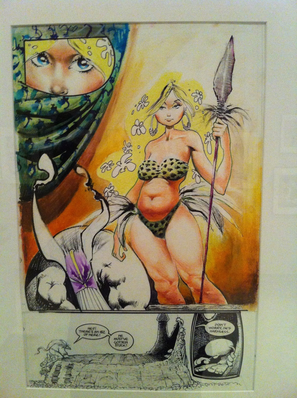
At the time we visited, they had a Sam Kieth exhibit up. It was nice to see his stuff up close. It's interesting, because I have a few books with his art in it, but somehow I just never appreciated it as much as I did when I saw his actual art. Don't get me wrong, I like his stuff, but seeing it in person is certainly something else.
 |
I have a few issues of the Maxx, but you never quite see the
energy he puts in applying the paints with the printed material. |
 |
| This is a close up of a two page spread. I love the hatchwork he used in the face. |
 |
Always good to see inkwork at actual size.
Nice use of solid blacks and hatching to give a nice range of tones. |
 |
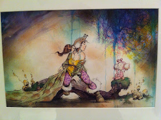
There's a lot of texture going on in this painted piece.
I think it's his personal work, but I'm not sure. Creepy cool. |
In the rear of gallery they have a few of the permanent pieces (at least I think they are) on exhibit. It was a nice collection of some great work. It's very interesting to see some of the newspaper strips up, and just thinking about it from a production standpoint makes me appreciate it even more. Like for instance, the economy of line, the set up and the punchline (for the gag strips), all within 3 panels, and the stress involved to deliver the work at a daily pace. And of course, it also has to be good!
 |
| Walt Kelly's Pogo strip original inks. His lineweight and hatchwork is killer. |
 |
Hal Foster's thumbnails for a Prince Valiant strip. Great to see this part of
the production before he goes into the final piece. Even his 'people blobs' on
panel 3 look great! |
 |
I have always wanted to be able to create a rogues gallery as awesome as Dick Tracy's.
Chester Gould had that best character designs. It may have been for a deadline, but I love seeing giant
spots of black on a page. It just makes inks look so much 'fuller'. Look at how giant that text is for legibility! |
 |
I always read Blondie when I was a kid and I think I watched
the live action black and white re-runs on TV too. I always did wonder why
Blondie married that goof Dagwood Bumstead! And he's just being mean in this strip! |
 |
Always great to see a Will Eisner original. Loved the shadow of the
glass signage casting itself on the Comissioner Dolan's trenchcoat. |
 |
I vaguely remember reading these in a collected edition in a
library in a golf club in Alabang, Philippines. I remember liking the
art for Alley Oop, but I cannot remember anything that happened in the strips! |
 |
I have no idea why, but it's only when I saw this panel from
George Herriman's Krazy Kat did I realize that that's the style
Art Spiegelman was going for in Maus. Or maybe I did know, I just forgot? |
 |
| I loved seeing this color guide. |
 |
| A bit blurry. I've never seen a Watterson original before this. |
 |
Detail of the watercolor work he did for the cover. Very clean application
and such nice subtle shifts in color. I always loved his choice of colors. |
And way in the back of the museum, there's a looney tunes/ Chuck Jones exhibit. And looking at some of his stuff certainly makes you feel very small as an artist!
 |
Detail of the gradient of the light on the floor
applied in Guache. Pretty awesome craftsmanship. I
REALLY sucked at Guache in school so I really feel
super, super tiny when seeing how great it's applied in this piece. |
 |
| This is a great sketch. |
And finally in the main gallery, there's a few contemporary artists pieces being displayed for limited time as well. One of the artists in it,
Roman Muradov, I've actually bought one of his comic books at some store in Japantown during a festival. I think he was the one who actually sold me the book, but I wasn't expecting anything when I flipped through his book. Anyhow, my mind was blown! His stuff is great.
 |
| A piece by Roman Muradov. |
I've actually been seeing his comic books all around town (In San Francisco) on the indy racks in comic book shops as well, as I'm trying to figure out local places that can carry my books.
 |
| I See what you Say by Christian Robinson. |
 |
Sadly, I cannot remember the title or the artist
of this piece, but I dug the colors and the shapes of the animals. |
 |
Elenor Davis' Talk to ME, Not to My Daughter. I'm
always a sucker for a nicely applied complimentary color scheme.
Uhhh, look no further than this Blog's header image to see what I mean! |
 |
A splash page by Eleanor Davis with Drew Weing.
This is from the Secret Science Alliance and the
Copycat Crook. I'm going to have to pick up a copy of this book! |
 |
Aaron Reiner's A Strange Storm from Night of the
Waxing Moon. Sorry it's blurry. I can't seem to find this book on Amazon or
Instocktrades for order? Maybe I have the title wrong. Looks great nonetheless. |
And finally, in the room next to that gallery, the room was blocked off, but I saw this:
Noooooooooo!!!!! The Superman exhibit wasn't up yet! Gah!
Apparently it's up NOW. I'll have to make the pilgrimage there sometime next month for Supes' birthday.
And that it for tonight in San Francisco. good night and God Bless. The Neverending battle will continue!


No comments:
Post a Comment