Pages

Saturday, May 31, 2008

My Comic: page six

Plug, plug, pluggin' away! Just finished page six of my book and as usual it took me longer to figure out the colors, yada yada yada. Anyway, the main difficulty was this outside scene now had 'real colors' in it. My main character's uniform is for the first time revealed to the reader... and to myself!

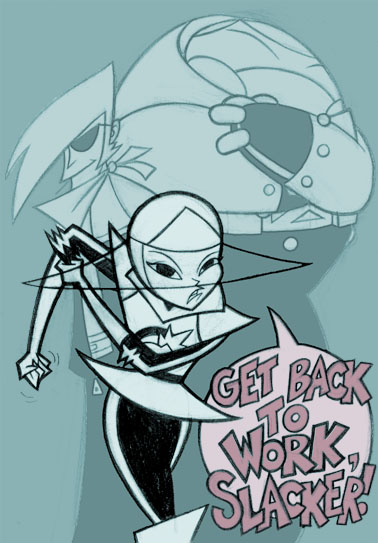
Yep, all this time I had no idea what color my main characters' uniform was to be! I've always colored her in a monochromatic fashion, I never really stopped to think about her color scheme. Anyways, after much mulling over and trying out different colors, it occured to me there was only one color that would work for her all those other times I colored her in: white.


My friend, Roque, cautioned me though: since he and his studio (Ghostbot) had done a pilot where a character was all in white before. He told me it'd be a tricky thing to do. And sure enough, I was raiding my collection of Samurai jack and Star Wars: Clone Wars animated (Genndy Tartakovsky version) for some color help!

I got her colors to work on the page finally, but there was something missing to her being in all white. Something about the color of her visor was bugging me. It seemed so plain. As usual, when stuck with color theory, I messed around with Photoshops' Hue/Saturation adjustment tool (best thing ever)! And now her visor becomes a very distinctive part about her, and gives me a nice variable to mess around with when I stick her into tricky color schemes. plus while coloring it in, it also gave me ways to incorporate the visor color into story telling too, so it ended up being a win/win situation.

A little side note/ bruised ego rant: the visor color and her design, I've realized, is a tip of the hat to Battle of the planets. I hadn't realized that's what I drew inspiration from until a friend of mine pointed it out! Makes sense! I even have a sequence in the book that's like the intro where they all float down in a circle (Silver hawks does this in some of their episodes too if I remember correctly!).

My ego has taken quite a beating realizing that my stuff isn't very original, but I've gotten over it after with awhile. It's quite a humbling experience, mind you, and really knocked the wind out of my sails for awhile. Anyway, I picked myself back up and remembered what I originally set out to do on this book.

I wanted to have fun while drawing comics. And I wanted to tap into that same fun I had as a child that I believe is missing in me nowadays. Apparently, I am totally tapping into that childhood better than I thought! I have found working on these pages has brought back the sense of enjoyment I used to have when I drew comics for myself a long, long time ago. The main thing that gets me over my unoriginality is that so long as I'm aware of the people I'm ripping off ("influenced by" if that's too harsh!) and simply embrace it, and strive to build on their knowledge, eventually I'll get better.

Heck, I'm ripping off Yoshitaka Amano, Osamu Tezuka, Shotaro Ishinomori, Genndy Tartakovsky, Jack kirby and frikking Sonic the Hedgehog to name a few! Hopefully I'll learn a thing or three from these people (and hedgehogs)!

My giant sized ego always makes me forget this truth: I am far from being anywhere good yet. But hopefully with this comic book, I can start working all my assorted kinks out! So thank you for dropping by and taking a look at my personal work-in-progress, truly warts and all! And that's it for today! Good day and God Bless!

P.S. And I know this has been stuck in your brain since I mentioned it; sweet intro isn't it? Gonna have to steal something from there! ;)

Thursday, May 29, 2008

My Comic: Page four and five colors

Got some more updates for my comic book. Everything seems to be going well. I do have to confess though, I can't believe how long I take dwelling on colors, especially on something so simple! The reds really weren't a problem, but for some crazy reason, I had a hard time deciding on what color the shine of her eyes would be on panel two of page six.


I kept switching from a light red or sky blue, to an undersaturated blue, to a white, to a dark green, to black, to... well you get the picture. On one hand a red hue was the safe bet, but when I slapped that blue on there, there was something nice about it (at least to me). I kept stressing out whether people will get thrown off by it too much. Anyway, I ended up going with the blue of the sky. It makes for a nice highlight, and connects the panel to everything else. I think what really clinched it for me was that it also signified what she's looking at (the sky outside). Now I don't know if anybody's gonna even get that, but in my head (for now) it makes sense. That blue color is also the perfect lead in for the next page.

Well, at least if I can get it to work! Tune in!

Friday, May 23, 2008

My Comic: Page Two and Three colors

Strangely enough, coloring these two pages seemed to take more brainwork from me than the first page, even though these pages are a whole lot simpler than the first. There's something very difficult about coloring a very sparse background. My brain thinks it needs to color more in than it should, and add more details. I found out, while coloring these pages, it seemed the simplest solution was the best.


Anyways, I'm tired! No long winded commentary this post! Good night... er... good morning and sundan ang susunod na kabanatan!

Sunday, May 18, 2008

My Comic: Page one colors

I haven't had a lot of posts up on my blog recently, but for once it's not because I've been slacking off! In fact quite the opposite! I have just finished inking, cleaning up and lettering my comic book! And I've just finished laying down the first color pass of the first page! Quite exciting!

I'm just coming off of three weeks of comp time from work and while I slacked off a bit in the first week, I made sure to keep a regular work day for the rest of it and power through to getting my comic book done! So, a lot of days spent scanning, piecing, re-sizing, inking and lettering went into effect.

While all the other things felt like the usual production work, I gotta say: adding letters to my comic made it come to life! It was such a rush to put bubbles and arrange panel flow!


I'm not sure if the final panels' colors are going to be these since I don't know if that color scheme will work for me yet later on in the story. A friend of mine has suggested I do a quick color study on thumbnails of the whole book so I can take a look at how I want the colors to interact. I kinda just plowed into this first page without knowing if these are going to work later on... Anyway, it's a work in progress, hopefully I'll have more in the coming weeks!

I'm also a little paranoid about how my colors look on my screen compared to everyone else's monitors. My Cintiq's colors look like how I'd want them to be, but then my secondary monitor's colors look out of whack. Sigh. The usual stuff I suppose! Anyway, until next post! Good night and God Bless!
Related Posts Plugin for WordPress, Blogger...