Pages

Monday, December 31, 2012

In 80 dates

Quick post for tonight as well as the last post of 2012 for me!

A friend of mine has been drawing up some 1 panel comics dealing with the 'adventures' of dating. It's light hearted fun that takes from her and her friends' dates, but when you read through them, you'll find more than a few that I'm sure you've been on before (the female version of Date 11, for me sticks, out in my mind the most). Head over Approaching the issue in 80 dates to check it out and I also have it in my links section.

Anyhow, to show my support as well to thank her for the great blanket she made for my daughter for Christmas, this post is dedicated to her! Complete with fan-art! (And of course, it will be complete with the neverending battle process-post.)

So first off I do a quick sketch. I went through her website and picked which character I wanted to draw. At the same time that I was composing the image I was also trying to figure out how to draw her characters. Truth be told, I just went right into the final inking phase without really figuring out 'my style' for them, but it worked out in the end.

working fast and furious on the sketch phase. I kept it loose to get my idea down quick. A little too loose maybe...

In the inking phase, I started filling in blacks, which among other things I did strays from the style of the comic, since there are no heavy black areas. I figure I can solve it later in the coloring stage. It was kinda tough since I had to go through the website again on the inking phase, because my sketch phase wasn't very tight. I was very loose, so certain details like what characters were wearing aren't in the sketch.

something very cool occurred to me as I was drawing these characters: essentially they have the same face, but there's a lot of attention on their hair that really sets each person apart from one another. 
Next up, I add colors. Here's where I REALLY break the art direction that's been set (and hopefully she won't hate me for going completely off-model!). I still kept in mind how she worked the colors in the original strip. My natural Bomb Squad coloring tendency is to add shadows to help pop out characters from each other. However, the original strip's style is simple, but specifically chosen shades of gray for the colors. It was very tough not to rely on my old coloring tricks, since every character was on top of everyone else in my comp.

I have a version where I don't use a color fill for the black inks and it looks pretty cool too, but I think the purple fill on the line work helps connect it better to the original strip.

Approaching the Issue in 80 dates gets superhero-ey!
And that's it for me! Go check out my friend's website and read through it already!

Saturday, December 08, 2012

ESWAT

Still haven't gotten into the flow of working on my third issue...  My daughter, my wife and I are all sick, my hotmail account (which I haven't used in years) has been hacked, and all my yahoo email and contact info has been deleted. Also, my portable hard drive with a lot of my professional work has been messed up, so I can't access it.

I've gotten lazy and in between taking care of the baby, the wife and myself I've been doing hard core video game time with Sonic Racing Transformed and Mighty Switch Force on the Wii U and Bayonetta on Xbox.

Suffice to say, I haven't been working on my stuff.

However, since my last post was about shinobi, I thought to throw up some more old-school gaming art from the archives...
Now that I think about it, this dude is kinda like a mature Mega Man...
E.S.W.A.T. was my system seller for the Sega Mega Drive (Sega Genesis, whatever). I think it came with an Altered Beast pack-in (which was still all the rage back then and I also really liked), but I asked if I could swap it out with this awesome game. I think I played it at a friend's place and I really, REALLY liked it. I would go to a friends house and played all sorts of multiplayer games, so I doubt we played ESWAT much. But it made quite an impression!

I remember these sliding dudes were a pain in the butt!
The game has an arcade counterpart, but plays totally different. The home version was more like a shinobi game and had two levels where you didn't have any armor: you were just a normal cop. The difficulty was pretty hard, but it was a lot of fun. My hardcore gaming muscles have atrophied what with all the continues and save points these newfangled games have nowadays, I doubt I could hang with it anymore. I DO fondly remember towards the end the suit gets an awesome power up and you can unleashed this super attack that had you spin in place firing a GIANT laser from your arm (which overheated your suit, so it'd be a move you can't always do) destroying everything! Fun stuff.

This was a blast to mock-up. The foreground buildings were built by a coworker then I painted over it  and drew a lot of the background,scaffolding, and glow effect-y things.
Life was a lot simpler then! The Mega Drive box art for this was awesome, I remember, and googling it up shows that it still is as awesome as I remember! Anyway, that's enough nostalgia for the day!

The neverending battle (in my body and mind!) continues! God Bless and thanks for stopping by!

P.S. I remember drawing the giant green boss robot too, but I think I may have lost that along with the stuff on my hard drive! What's left of it, lives on in that screen mockup above!

Friday, November 30, 2012

Shinobi on the PS2

I've finally gotten a chance to update the ol' blog today. But before I get to the post's title a little comic book project update. I've been able to thumbnail out until page 12 of the book. So I've at least hit the halfway mark on that! I'll post my roughs next time.

I've moved desks this week, at work, so I've lost my lovely window seat. However, over by the new spot, I'm sitting by an artist that I used to work with a LOOOONG time ago at Digital Eclipse (The sadly shut down Backbone Entertainment's old name). He's a very talented dude! But anyway, I may have forgotten this, but it turns out we have alot of things in common. Including video games that we LOVE. And two of them are the Shinobi series on the PS2.

He still is the Hot(SUMA)ness. Wah wah wah.
I remember loving every minute of the first game when it came out and totally being blown away (and thankful) when a sequel came out in the form of Nightshade. I don't think it made a lot of money, so this version of the IP stopped at that sequel. I think another game, Ninja Gaiden, came out and wowed everyone with it's looks that year. And sure, Shinobi didn't look that great compared to a lot of the games around at the time, but it's gameplay was something unique and new, and it kept me absolutely hooked! I never liked the gameplay of Ninja Gaiden at all, Shinobi was just a better designed game. It still is at the top of my action games list (happily alongside Bayonetta and Gunvalkyrie!).

God Bless you and the neverending battle continues! 

Wednesday, November 21, 2012

The Neverending Battle gets Chronicled!

I made it into a San Francisco Chronicle article!

At the company I work for, Zynga, a reporter from the San Francisco Chronicle wrote up an article about the things that Zynga provides as creative outlets that aren't necessarily connected to work. An employee at Zynga, Kim Herbst, set up a gallery show for all the employees at Zynga. So not just artists, but everybody in the company interested in showing their stuff has access to it.

I had exhibited some of my pieces there, and the timing worked out for me because it so happened that the reporter from the Chronicle (Stephanie Wright Hession) was dropping by to look at the gallery while my pieces were still there! And wouldn't you know it, she actually liked my pieces! I was pretty humbled and thankful that she picked them, considering there are quite a lot of really great artists at Zynga that had their stuff up too. By the way, you can have a gander at what those pieces are here and here if you're curious!

I have a nice chunk of an interview in the second page of the web article on SF Gate right here.

I ran out to grab a couple copies of the newspaper from one of those newspaper-box-thingies right by the corner of my office building. I have to tell you that it was sadly an alien experience for me to pop 75 cents into the coin slot, open the little door and grab a copy. I love the print medium. But it's been so long that for me the act of buying a newspaper was so foreign! It felt so cool! Yeah... so sad. Anyway here's a look at the paper:
Good ol' Fisto made it onto the printed page!
Anyway, if you're coming onto my blog from the link on SF Gate and the San Francisco Chronicle: Welcome! My blog's all about my process of generating art, so a few entries probably won't look too pretty but if you can stand the scribbling, feel free to look around!

Thanks for dropping by and as always, the Neverending Battle continues! (and if someone can tell me what the real name of a newspaper-box-thingie is I'd appreciate it!)

Sunday, October 14, 2012

Bomb Girl Facial studies

It's been a while since my last post, and frankly this post isn't all that great either. Still it is part of the process and all that. I've had a lot of family related stuff going on lately (all the good stuff, mind you!), so my personal projects have been taking the back burner. I haven't quite gotten the hang of maintaining a balance, but I'll try this week to work it back in. I'm thinking of doing layouts during my lunch break and see where that leads me. Hopefully my engines will get revved up again.


It's funny I didn't do this earlier, but I've just recently started sketching facial expressions for my main character. She's usually just very stoic in my book (or really angry!), so it was nice to do a little bit of exploration. I think I've only touched on a little bit of this exercise, so I'll try to make it a regular thing. Hopefully, I'll be able to work some more of these expressions in the later issues. That's it for tonight! Continue on neverending battle!

Monday, September 10, 2012

My Comic Book: Issue 3 page 4 Final

It's a little depressing how long it took me to get a simple page like this done. You would think with a baby that sleeps for an average of 2 hours in between feedings, I'd have a lot of time inbetween! Yeah, I know rookie mistake! Anyhow, trucking along with the comic, and I'm working kind of different with this issue.

I usually draw, ink, letter then color a book (in that order). So what I mean is I get all the drawing and inking done first for all 24 pages. Then do a lettering pass for all the pages, then a coloring pass. But these last few pages, I've been adding the dialog as I wrap up a page. And for this page, I decided to add final colors. It's kinda nice that I can put it together to final like this... another page that I can mentally file away!

Flashback sequence
They're still trying to figure out where Wondercon will be this year, but I'm still aiming to get the third book done by then. Hopefully I'll have 3 books to sell at the con if it's here in San Francisco.I have to admit though, after finishing this page? I'm not sure I can make it by that deadline. We'll see! That's it for today. Good day and God Bless! It's an impossibly nice day in San Francisco today!

Monday, August 27, 2012

My Comic Book: Issue 3 Page 2 and 3 Part 4

Well my baby is born!

Hope Juliette Lee Bautista was born on August 9, 2012 at 6:55 PM! And boy, have we been busy since! I've been experimenting on just how little sleep I can get away with during the day so I can still squeeze some hours to work on my comic book.

Honestly, I still haven't figured it out! But I've got an update on that splash page I've been working on (seems like it's been awhile)...

That's it for now. Sleep deprivation makes it hard to function properly during the day and even harder to muster up the energy to be creative! Anyhow, I'm going to try to get a few minutes of shut eye, before her next feeding!

Monday, August 06, 2012

The Baby's Room: Illustration 2


The due date is 9 days away, and I actually got these drawings for the baby room done! When I see these three illustrations together, it seems that the flower count gets raised with every piece!

The wife gave her seal of approval on this one, so this project is almost done. The next step is to go scout out some picture frames this weekend (among a multitude of other things to get ready before the baby arrives). 

Saturday, August 04, 2012

The Baby's Room: Illustration 3

We have 11 days to go before the baby's due date! I just finished the third illustration for the baby's room. The wife had a better reaction to this one than the first. I'm hoping to finish the last one BEFORE the baby arrives (and who knows when I'll get the right frame for these).


I might revisit the contrast on their legs if I have time... yeah, right! I just realized it's quite a difference in style from the Batman scribbles I've been doing!... ANYWAY. Good night!

Thursday, August 02, 2012

The Dark Knight Rises - Bane

I don't like the character of Bane at all. When he first appeared in the comic books, he just didn't seem like the type of guy that could break batman (I didn't like Doomsday either).

But Christopher Nolan and Tom Hardy definitely made him a good villain in the movie.


There were some points that I still had a hard time understanding what Bane said, but I did like the portrayal of him. I thought he was a good, different type of 'bad guy' for Batman to face. And I also liked the accent Tom Hardy gave him too.

Saturday, July 28, 2012

The Dark Knight Rises - Catwoman


Just sketching around at work in between renderings... I want to go watch that movie again!

Monday, July 23, 2012

Deshi Basara!


I really enjoyed this movie. More than the Avengers (yeah, I said it!). While there are many things I can nit-pick about this third installment, I never got that jazzed-up emotional high at the end of Avengers like I did with this one. Also, I can't get rid of the Bane chant that keeps running in my head.

Tuesday, July 17, 2012

Virtua Fighter 5: Final Showdown

I love Virtua Fighter. I'm not very good at it, but I LOVE Virtua Fighter.

Virtua Fighter 5: Final Showdown by Sega got released around a month ago as a downloadable game for the xbox and PS3 for 15 bucks! It's such a steal! Virtua Fighter is one of the the deepest fighting games out there. I was so excited when it finally came out onto the console since it was only available in the arcades for awhile.

I drew up some sketches of the characters, while waiting for things to render at work. I worked really messy with a ball-point pen. They're not very finished, but I liked how loose I got drawing like this.

Jacky Bryant is the character I like playing as.
 Jacky was the first character I drew, and I was still still trying to get used to drawing in this style, so it's a bit stiff. I missed a lot of details in his jacket too. I like the cheesy one-liners the characters would say in the games so I incorporated some of their lines in the drawings.

Of the newer characters, I liked trying to learn El Blaze.
 My anatomy still needs a lot of work, so this next one you can still see I was struggling a lot with the drawing. However, this way of drawing lets me be messy and make mistakes, and it's okay! Everything looks like a mess anyways!

A friend of mine, likes to man Jeffrey as his fighter.
There was a lot of re-drawing going on in this Jeffery sketch, but I got it to something that I'm okay with.

UPDATE: I did this Sarah drawing the day after I posted this first batch. I just had to include her line. I remember doing a double-spit-take the first time I heard her say it in the game (VF2?). Also looks like I have some different tasks going on at work so this might be the last of these sketches...

Not really the pose she was in when she said this.
I love Virtua Fighter. Have I mentioned how much I love Virtua Fighter? Awhile ago, I randomly ran into Yu Suzuki, the creator of the game, at an E3 right as he was leaving, and I just had to have him sign my copy! Check it out:

Probably not worth anything, but worth a lot to me!
It's sad that more people don't play this game. It's actually pretty easy to get into, just 3 buttons, block, punch and kick. It's definitely not as flashy as any of the other fighters out there, but man, the satisfaction of actually figuring out a character is pretty amazing. I also love that button mashing is not rewarded in this game, scrubs will get punished.

Anyhow, that's it for today. On a random note: I'm getting my free preview tickets for The Dark Knight Rises tomorrow! YAY! Good night and God bless.

Sunday, July 15, 2012

My Comic Book: Issue 3 Page 2 and 3 WIP part 3

I've been procrastinating on doing the background in the first panel, but I finished all the panels already and even have a rough script...


...I can't put it off any longer! Backgrounds and crowd shots always make me tense up for some reason. I'm slowly getting used to doing crowds, here's hoping I get the same way with backgrounds. The neverending battle continues!

Monday, July 09, 2012

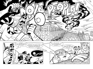
My Comic Book: Issue 3 Page 2 &3 WIP part 2

Started filling in the bits of this double page-splash. The little 'lighting bolts' coming out of the megaphone might be getting a little bit obscured, and I don't think line-weight will help. I'm hoping to cheat it into focus with color later on.


I'm going to hop back onto doing the baby room illustration next, and let this one sit for a bit.

Thursday, July 05, 2012

The Baby's Room: Illustration 1

The wife and I are preparing our baby's room and she wanted a 'lamb' motif for it. So as I set out to draw an illustration we can frame and hang up by the crib, we kind of came up with the idea to make it something that can help the baby sleep.


And of course, since I like comic books, I tried to work in a simple sequential art in there. So the idea is to have the lamb 'jumping' over a fence. Like, y'know, counting sheep. To do this sequence, I laid out plans for 3 'panels' or in this case illustrations. Probably not the best idea to draw that much, knowing my speed, but hey.
When stuff goes up onto the walls, my wife becomes the art director, especially when it comes to the baby's room. Below, was my first attempt at the final.
The wife didn't like this one at all. She said the lamb looked old.
She couldn't really pinpoint what it was and thought it was the eyes that made the lamb look old. I thought it might be the poofy wool I drew. So for the next attempt, I went with simple shapes.

Round two!
She seemed to be okay with this attempt, though I'm not sure if she's completely crazy about it! But it was looking good, so I just ran with this style.

My wife says the baby will be "cooked" in 3-4 weeks, so I don't have much of a schedule to work with, considering I'll be doing this mostly after work and in-between all the prepping, baby shower and house chores we need to do before the baby arrives!

That's it for today. I had a thought this morning, after getting bombarded with all the excitement about the Higgs Boson particle discovery (I had to watch a video that put it into layman's terms so I could understand what the hubbub was about!). As we marvel at the parts of the 'watch' and man's ability to examine the pieces of it, it's surprising to me that people don't appreciate the watchmaker more.

God Bless you all, and the never-ending battle continues!

Wednesday, July 04, 2012

My Comic Book: Issue 3 Page 2 and 3 WIP

Just comped up my 2 page opening splash. Lots of perspective and buildings going on so as always I'm apprehensive!


Not a lot of progress, just slow and somewhat steady... There seems to be a lot on my mind lately! Work's becoming a little nutty, we're trying to prepare the baby's room (I'm drawing up something) and the countdown to my baby's arrival is in the back of my mind, so yeah, I'm a little stressed! 

Also, there's quite a lot of goings on in the comic book industry that I've been enjoying recently, specifically in the digital arena. I'm finding myself more and more distracted because of all the buzz and I can't help but feel like I'm getting left behind and I need to step it up and get this 3rd book DONE!

I really do need to focus, shut down the social media distractions and maybe even putting aside comic book reading time and just have to keep drawing and push ahead.

God Bless you all, and enjoy your 4th of July!

Sunday, June 24, 2012

My Comic Book: Issue 3 Page 1 WIP

... And it's started! 

I've done my first page for Issue 3 of the Bomb Squad! You could technically say I already started on Issue 3 when I finished the cover, but mentally, for me, that's not REALLY the book. It really doesn't look like I did much drawing, but it took me awhile to rev up my engines to get going on this. I've started both issues one and two with a closeup and a slow zoom out per panel to reveal the scene. I don't think I wanted to do the same thing for this issue.
Page 1 done. Onward!
Instead, I'm just showing closeups of various things going on in the scene, and I wanted it to be chaotic and confusing. There are no word bubbles or sound FX text, but I'm hoping doing it like this will make the reader create their own loud sounds in their heads as they piece these separate images together. I'm hoping as I add  color later on, this will also add 'sound' to this page. 

This is the first page of the book, so once this is flipped, the reveal on the next page will be what's actually going on in this scene. I MIGHT do a two page splash that takes up the top two-thirds of the page, and a wider shot of the scene. I'm hoping the contrast of that grander panel will suck the reader into it because of the contrast of the smaller, zoomed in panels from page one. At least that's the plan!

Here's hoping the rest of the 23 pages will be smooth sailing (riiight....)! 

Sunday, June 17, 2012

Father's Day!

Happy Father's day! This is my first one I get to participate in! I'm starting to get a better picture, and better appreciation for all the fathers out there as my own baby gets ready to join my wife and I outside of the womb soon!

So for this post, it's a mix of comic book geeking-out as well as some Bomb Squad sketches I've been digging up as I try to put together the sketchbook version of issue 2. I've got a ton of stuff in the home office. It's a mix of piles of paper from sketches, old collage artwork and of course my comic book collection. So when I start tidying up the place, I can't help but get lost in nostalgia when I'm putting things away (and most times I get trapped and lose all track of time!).

Issue 3 of the Bomb Squad is a spotlight on the robot of the group, Mur. I took out the initial character design sheet I did for her in the beginning, and realized her shape has really changed when I got to draw her in the comic. I think I might try to conform to the initial design more in the third issue, since I liked that more, but we'll see. I dug up the old Character sheets I did for Kid Hotshot and the Chief too.

Mur, The Chief and Kid Hotshot
I found myself flipping through some books from my shelf just for kicks and I grabbed Asterios Polyp by David Mazzucchelli, The Art of Nick Cardy and lastly, because Comixology has a 99c sale this father's day weekend, my early issues of Starman.


I don't think I ever grew up reading any of Nick Cardy's books, I just remember reading about him. I stumbled onto his art book in a used bookstore, and I really liked his stuff. I like the way he drew his women's faces and flipping through it recently I noticed my wife's features look like a Cardy girl! I showed it to her and told her she looked like Aquaman's wife. I don't think she found it quite as amusing as I did! Anyhow, I married a Cardy girl!

Nick Cardy is awesome.
I took advantage of Comixology's father's day sale this weekend and bought some early back issues of Starman to round out my 'collection'. I ate up Starman as it was being published back in the mid-nineties. I really dug Tony Harris' art and James Robinson's writing could do no wrong for me. It's gotten released in hardcover format recently, and I've been tempted to buy it, but honestly I have no space! I was missing a few issues in the beginning of the series so it was really nice to pick them up at 99c a pop and fill in the holes. So, I've be reading those gaps and flipping through my issues back and forth and it's been such a delight to be transported back to that time. What a great series. It has such a distinct flavor of modernizing an old franchise and yet holds onto it's roots and appreciates it and honors it at the same time. I love the series so much I actually drew a pin-up for it, as my entry for "favorite superhero" when Wizard had a contest back in the day.

Some of Tony Harris' early Starman work.
I don't really know what I was expecting when I picked up Asterios Polyp when I first saw it, but it's a good book. Definitely very different from your traditional superhero type book and even your indie type comic honestly. It challenges what traditional conventions you see in sequential storytelling from it's colors, style, layout and down to it's lettering. I don't think that it would be for everyone, and my brain still gets a workout as I read it, but it's always engaged me whenever I read it. And that's always a plus in my book.

I liked this splash page in Asterios Polyp
I also picked it up because I had David Mazzucchelli as a teacher at the Rhode Island School of Design when he taught a sequential storytelling class there, so I wanted to see his latest stuff. I really doubt he'd remember me, but I had a good experience in that class, even though honestly, in hindsight, I really shouldn't have! I liked doing the assignments but I was never the best draftsman there. So my stuff had some moments but for the most part, it didn't look so hot. In fact one of the comments from David at the end of class was: "Learn how to draw". You'd think I would've sworn off drawing from then on or at least be forever angry at him, but strangely enough I didn't flinch when I read that. I was like "Okay, awesome! David Mazzucchelli just told me, ME! To learn how to draw! Yes!" Haha, yeah I guess I was starstruck!

Anyhow, as I get older, I come to understand that there's quite the distinct possibilty that I would never be that awesome at drawing. But I will never give up on trying. Another teacher I had at RISD (Tony Janello) has said something  about how there are like thousands of horrible drawings in every artist. And a few good ones too. But to get to the good drawings we have to draw those thousands of bad one first. So maybe I have more than a few thousand bad ones in me, but who cares? I really do enjoy drawing and specifically doing sequential art, that I think even if everybody hated it I would still be drawing.

I don't really have a choice, I find it very fulfilling when I draw and I think I become more balanced when I do it. When I don't? Just ask my wife, I get real crabby when I don't get any creative time in! Anyway, that's it for the ramble. Thanks for lasting this long! A Happy Father's day to every father out there. I have joined your ranks and am slowly understanding just the kind of hard work it takes to be one. And I really do appreciate, now more so, what my Father did for me. The neverending battle continues!

Friday, June 08, 2012

The Bomb Squad #1 goes digital!

Woo! IndyPlanet Digital now has the first issue of The Bomb Squad up for 99 cents! Yay! I'm joining Digital Publishing! I just sent in the graphic for my banner ad, so I get more visibility on their store.

Goin' Digital!
I hope they pick it and put it up on their site. It might take some time to surface, even if they did! Still, I am very grateful to Ka-Blam and the service they provide. I've been looking into figuring out how to get my comic book on digital 'shelves' lately. As much I love the printed medium, digital just seems like the cheaper route to go for independent publishers. And I can take the risk and sell it for much cheaper than print. 

Gah, Ka-Blam's given me all the outlets I'd need to publish my stuff, now I gotta start figuring out how to market this thing...!

Anyhow, I'm very excited to be in the digital space! My mind is blazing with how to create comics that are tailor made to that format now! I'll be updating the 'store' tab soon with the digital option. But for now... 

Ehehem:

If you want to buy the digital copy of The Bomb Squad #1 click HERE!

I really gotta work on Issue 3 now!

Wednesday, June 06, 2012

My Comic Book: Issue 3 Cover Final

I did more color adjustments to the saturation and contrast on the shadows and added some finishing touches. I still have a few things I probably need to fix, but for now, I'm leaving this one alone.


Onto the interiors!

Tuesday, June 05, 2012

My Comic Book: Issue 3 Cover WIP part 3

I'm onto the coloring stage now, and I'm starting to bring out certain elements better on the cover. I'm not so sold on the way my name looks on it or that area around Mur's feet, but we'll see. 


I think I'm getting a little too detailed with the feathering on the shadow color on her fingers, but we'll see how I feel about it when I come back later. Towards the bottom of the cover I feel like... I'm missing 'stuff'. Not sure how I feel about that either...

But otherwise, I think I'm heading in the right direction with this. I've been slow in getting back onto the sequentials of issue 3, so switching to doing these covers is helping me build back up to it. They're fun and at least I'm still making progress even though I'm being lazy!

What I've found interesting as I'm doing these covers, is that I think in the back of my mind I'm not really creating them for visibility on the shelves. Or at least not in the traditional Marvel/DC way. Logos are usually at the top of comic books and number information is normally at some consistent area and there's usually some room given to the barcode box (maybe not as much anymore). Also as a graphic design rule, Logos shouldn't be messed with as much as I've been distorting mine on the covers! When I step back from these covers and take a look at them with that in mind... they fail pretty miserably!

I think since I'm publishing with selling it through a digital store in mind or even at a booth at a comic book convention, I'm not concerned with those factors, or maybe I'm just lazy. I dunno, just an observation...


Monday, June 04, 2012

My Comic Book: Issue 3 Cover WIP part 2

I added a few terrorists/hijackers into the cover. I've been trying to put a lot of action and adventure sequences into these issues, but I think issue 3 will be chock full of the rock-em-sock-em variety. This issue is a spotlight on Mur (the robot on the cover), and she's more of that type of character.


I'm losing a lot of the kinectic energy on the cover as I tighten it up (naturally!), so I'm hoping to get it back when I go into the coloring stage.

Saturday, June 02, 2012

My Comic Book: Issue 3 Cover WIP part1

I decided to try and see if I could make the cover for issue 3 first like I did with issue 4. It's okay so far, but I'm going to need to do a lot of tweaking to get it to a good state. We'll see where this drawing goes!


Continue on Never-ending Battle!

Saturday, May 26, 2012

My Comic Book: Issue 4 Cover WIP part 4

Yep. I'm still messing with this. It didn't really take that much time for the tweaks, but I've been distracted watching 'Fringe' while I'm working!


I might still mess around with the contrast of the Logo with the background when I put it to print.

Saturday, May 19, 2012

Confessions of a Comic Book-aholic

I haven't been working too much on my comic book recently, so no new artwork posts. 

I have been rummaging through my old comic book collection and getting ready to get rid of stuff. And while it's sad to part with some of these, I think it's high time I purged myself of some of these books (again). And it's probably a good idea to do this on a yearly (maybe even twice yearly) basis.

I have too much.

I'm getting rid of stuff that I'm pretty sure I won't read again and some things I already have trades or hardcovers of. There are also quite a few that I really don't like. Unfortunately I still have a ton that I still love for the art or still dig the storylines. I have 11 shortboxes and  2 longboxes worth or comic books. And those are just the floppies. I have 2 bookshelves chock full of graphic novels and a half bookself's worth of manga.


Yeah. I'm a comic book hoarder.

Even though I don't REALLY care much about selling these guys, I can't help but look at online comic book price guides while I'm sorting through them all. The over-ridding factor though, is that I don't really have the time to sell these things nor do I want to sell them to collectors like me. No e-bay posts for my stuff.

I might try the local bookstore and get some credit for some of my manga, but otherwise I'll just donate them to the goodwill nearby. I figure maybe I can let some other non-collector-y, non-comic book reading type people enjoy these comics. Maybe I can spread the joy of comics!

Well, that's my rose-tinted idea anyway. These might also just sit in Goodwill forever.

Here's what I've weeded out of my collection so far:


It's around one longbox full of stuff. Eventually, I'd like to have just 2 longboxes worth of the floppies, but that'll take some time and letting go. Also, collecting manga is really amazingly space-consuming. Where do the japanese otaku keep all this stuff?

Tuesday, May 01, 2012

My Comic Book: More test prints

So the prints I had ordered from Ka-Blam are back. I noticed their paper stock had changed from the first issue, so I sent in an order for the first issue to test that out along with my second issue.

The first issue's print with the new paper stock is okay. The printer seems to have a problem with pinks/magentas and blues. My sky blue color is more of an aqua-ish (closer to blue) hue, but the new printing seems to just drop the green and prints out a blue.

My magenta/pink colors become more of a red and are really printing bright.

Can you tell which print is which?
So in the picture above, The first print is on the left and the second print is on the right. On the cover, the colors are less saturated than the first print and is not too bad. Over all I think it's acceptable. However, I'm going to try to re-process it a little with this new stock in mind and re-layout where the Ka-Blam ad goes. I forgot that I can shave off a few cents if I place the Ka-Blam ad on the outside back cover instead of the interiors. I can then pass the savings onto the reader.

Onto the second issue's 2nd test print.

Too Blue.
The blues I used on the cover got pushed too far into the Cyan range. The blue of this cover was planned to be lighter and closer to a baby-blue range. The light shadow's on the character's faces got printed pretty dark, almost as dark as the outline that surrounds them. The lighter colors are pushed to far to the white range. Contrast withing the blues is too much. And on top of that I'm not to crazy about the color of blue it's in.

The interior changes I did are looking okay. Some are more successful than others, some light colors are still to bright, but over all it's looking good in there.

Okay, so back to the coloring board! Almost there! Good morning and God Bless!

Sunday, April 29, 2012

My Comic Book: Issue 4 Cover WIP part 3

...added some background elements to it. I think I'm getting somewhere with it, but it's not quite there...


I'll try to add the issue number and my name on it (like the other covers) and see how I feel about it then.

Thursday, April 26, 2012

My Comic Book: Issue 4 Cover (WIP) part 2


Just had a few hours messing around with some elements for the cover. I'm hoping to do it just in black and white and some grays, but we'll see what I end up with. Not quite that easy without color to fall back on...

Tuesday, April 24, 2012

My Comic Book: Issue 4 Cover (?!?) WIP

For those of you that read my blog, you're reading it right. This is a work in progress cover for issue 4. How can that be you ask? Especially since I haven't even started working on Issue 3??

Since I sent off my test print for issue 2, I've just been taking it easy. I decided to just draw for fun and started drawing the Squad's Chief.


And what do you know? I kinda liked it enough that I' thinking of using it as the cover for Issue 4. It still needs quite a few elements, but it's nice to work on it so early on. I usually work on my covers at the end of the sequential pages, but I always freak out when I get to them.

I get so caught up on trying to make it look great, and by the time the sequentials are done, I'm usually burnt out by then. So this was a refreshing change.

Still, who knows, I'll probably look back at it later and hate it. That's it for tonight!
Related Posts Plugin for WordPress, Blogger...