
Monday, January 16, 2012
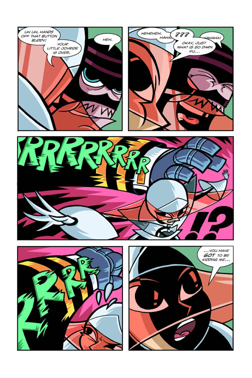
My Comic Book: Page 19 final colors


Saturday, January 07, 2012
Francisco V. Coching

My dad read a few of those komiks from back in a day when he was growing up and he remembers some of Coching's titles and a few others of his contemporaries (with Virgilio and Nestor Rendondo as his favorites). It's sad, because Filipino Komiks didn't seem to survive very well at all. Add to that a few of the amazing talent left the county to work in the states (and they seemed to disappear there even though they kicked SO much butt). Anyhow, it seems this book does a great job of showcasing a lot of Coching's work in that era (that I unfortunately missed).
So, have a gander at some of the pictures I took from the book and join me in enjoying his artwork.
 |
| The 'banjo' playing girl is my fave of this batch. |
 |
I like that tiny figure of the woman on the middle on the left side. |

 |
| Love this cover. |


 |
| I like the dress drapery here. |

 |
| I see some Hal Foster in there, Great use of the graphic blacks. |

 |
 |
| Awesome. |
What's crazy too is that he was able to draw and write 3 different projects with a bi-weekly schedule! Hope you guys enjoyed this stuff as much as I did! Hangang sa susunod na kabanata!
Wednesday, January 04, 2012
McFarlane + Alcala
No drawing updates today.
I'm on vacation and spending time with my parents, siblings and many assorted nephews and nieces for the Holidays in the Philippines. My wife and I have been staying in a room where my old comic books are still in.
Quite a few have gotten dinged up, tore up, misplaced or simply given/taken away. Everything else that's still there is ravaged by the heat and humidity.
I was tidying them up and deciding which ones to bring back to the states with me, and of course I can't help but flip through most of them and relive my childhood.
I found a few of the american comics I got actually have a few filipino artists in them doing pencil or inks. Which is an extra treat for me: I always feel like I never got influenced by the awesome filipino comic book artists when I was growing up, and I'm craving their stuff more and more as I get older.
Check these panels from Batman Year two, with Todd McFarlane penciling and Alfredo Alcala inking:
When I was young and stumbled onto this book, I had already seen McFarlane's Spider-man run before it. I remember not liking Alcala's inks because I was an Image zombie. Now that I'm older I realize I was a total idiot. Haha! I like how 'crime-booky' Alcala's inks did to the pencils and it fits the story pretty well. And hey, Alfredo Alcala is always awesome.
Switching gears, check out this awesome panel I stumbled onto, flipping through The Vision and Scarlet Witch #8:
That sound effect elicited a loud chuckle from me when I saw it! The title is also very Powerman appropriate! That's it for tonight in the PI! God Bless and a belated Happy New Year and hope you guys had a, as Powerman would say: 'Sweet Christmas'!
I'm on vacation and spending time with my parents, siblings and many assorted nephews and nieces for the Holidays in the Philippines. My wife and I have been staying in a room where my old comic books are still in.
Quite a few have gotten dinged up, tore up, misplaced or simply given/taken away. Everything else that's still there is ravaged by the heat and humidity.
I was tidying them up and deciding which ones to bring back to the states with me, and of course I can't help but flip through most of them and relive my childhood.
I found a few of the american comics I got actually have a few filipino artists in them doing pencil or inks. Which is an extra treat for me: I always feel like I never got influenced by the awesome filipino comic book artists when I was growing up, and I'm craving their stuff more and more as I get older.
Check these panels from Batman Year two, with Todd McFarlane penciling and Alfredo Alcala inking:
 |
| Great looking Alcala inking, giving a very solid, gritty feel to McFarlane's pencils |
 |
| Check out the awesome hatchwork that's a nice contrast to the graphic looking Batman in panel 1 |
Switching gears, check out this awesome panel I stumbled onto, flipping through The Vision and Scarlet Witch #8:
 |
| That could be the best comic book sound effect ever. Gonna have to steal it! |
Tuesday, December 13, 2011
What??!!
I was flipping through a recent Superman compilation book that was given to me as a birthday gift (well, it's an early present), and saw this image and wanted to share.
The book is called Superman from the 30's to the 70's. It's a good compilation of work, mostly in black and white, but it doesn't list out the writers or artists of the issues reprinted. Or even which issue was reprinted, so unfortunately I can't give credit where credit is due. The story, from what I can tell is called "Superman: Our first imaginary story." At least in the splash panel's lettering. In the caption on that same panel it says: "Read the adventures of 'superman, matinee idol'..."
Anyway! Just thought to share what I thought was a cool sequence.
 |
| Too awesome. |

Anyway! Just thought to share what I thought was a cool sequence.
Saturday, December 10, 2011
My Comic Book: Page 17 final colors
Just finished up this page!
 |
| Final colors |
I originally intended the last panel to be a totally monochromatic orange color since it seemed to really emphasize the action. But while coloring, I found that because of the way I composed it, it would still work even if the only thing orange was the background. The green colors from the panel next to it seemed to help connect the action just as well.
Christmas is coming soon, so I think my output will probably have to slow down. Good night and God Bless! The Neverending battle continues!
Thursday, December 08, 2011
My Comic Book: Page 17 WIP colors
Quick post tonight. Just blocked in the basic colors for this page.
A lot of the color scheme's already been figured out in my previous pages, so I just dialed this one in. Next step will be to add shadows and speed lines to help focus some of the important stuff going on in the panels.
 |
| Blocked in colors |
Tuesday, December 06, 2011
My Comic Book: Page 16 final colors
Finished up the colors for page 16.
I've been going bonkers on the coloring lately, ie. adding a lot of detail using color. So much in fact that I had to go back to some pages and tone down some things (some of my clouds are looking a little 'poofy' instead of angular for example). I have to remember to try to keep the detail simple and keep the look of the book uniform. This page helped me try to figure out that balance a little bit.
The large solid areas for color are tempting me to fill it up with color effects, it's really tough to resist the urge. Anyway, that's it for tonight... er... this morning! Good morning and God Bless!
 |
| Work in progress |
 |
| Final colors |
The large solid areas for color are tempting me to fill it up with color effects, it's really tough to resist the urge. Anyway, that's it for tonight... er... this morning! Good morning and God Bless!
Sunday, November 27, 2011
A ninja-shirt-birthday for my wife
Taking a break from coloring, I created a little design that I got printed onto a shirt using cafe press. I knew I wanted to draw her ninja persona from my wedding proposal comic around a year ago, but I honestly didn't know what kind of composition to go for. Here are some of my thumbnails trying to figure it out.
Still not really knowing a design, I went ahead and inked the character and tightened it up. I started trying to draw some tree by her feet in this weird 'fish eye like' perspective, but it wasn't working. It was too busy and called a lot of unnecessary attention to itself, and when you did look at it, you had no idea what it was supposed to be!
 So then I started coloring in the figure and started putting a flatter background design. Just simple colors so the heaviest blacks (the character) would stand out. Also I opted not to tilt her in this composition. The tilt was just me trying to make a confused layout more interesting.

I was getting somewhere at this point but it just wasn't enough. The cherry blossoms and stars just just seemed so... loose. The pieces just weren't fitting together. After a lot of messing around, I found the best answer, was of course, the simplest one. I added the branches of the cherry blossom tree to ground the composition.

It's not perfect, but definitely better than what I was initially going for. It took a lot of me really messing around, but I got it done to a state I'd be satisfied with to present to my wife. I sent it off to cafe press and ordered it onto a tank top.

The color came out a lot more faded and a lot more CMYK-y than I'd like. Still the print version has a certain charm to it. The design's a lot lower on the shirt than I wanted too. Anyway, the wife loved it when I gave it to her! And that's all that counts right?
The Bomb Squad update: I've finished coloring page 14 of the book, and I'm onto page 15. I'll try to do another update soon. Good night and God Bless.
 |
| Preliminary sketches: I went with 3 one on the top row. |


I was getting somewhere at this point but it just wasn't enough. The cherry blossoms and stars just just seemed so... loose. The pieces just weren't fitting together. After a lot of messing around, I found the best answer, was of course, the simplest one. I added the branches of the cherry blossom tree to ground the composition.


The color came out a lot more faded and a lot more CMYK-y than I'd like. Still the print version has a certain charm to it. The design's a lot lower on the shirt than I wanted too. Anyway, the wife loved it when I gave it to her! And that's all that counts right?
The Bomb Squad update: I've finished coloring page 14 of the book, and I'm onto page 15. I'll try to do another update soon. Good night and God Bless.
Sunday, November 20, 2011
My Comic Book: page 12 and 13 final colors
That Flu really kicked my butt. Been out of commision for so long, but now I've decided to just push myself to just get this spread done. I'm still not 100% but I'm good enough to finish up these pages. There are still a few things I'd like to mess with on the colors for this spread, but I really need to move on.

I had a more monochromatic scheme for the panels on the bottom, but adding a few splashes of color helps it along a bit without taking away from the main image.
My plan is to finish coloring the remaining pages by the end of the year. I'm not sure if I'll make it, but I certainly won't do it by nit picking everything to death! Onto page 14! Good night and God Bless!

I had a more monochromatic scheme for the panels on the bottom, but adding a few splashes of color helps it along a bit without taking away from the main image.
My plan is to finish coloring the remaining pages by the end of the year. I'm not sure if I'll make it, but I certainly won't do it by nit picking everything to death! Onto page 14! Good night and God Bless!
Tuesday, November 08, 2011
My Comic Book: Page 12 and 13 colors WIP (round 2 and 3)
Still plugging away on these pages. Caught a pretty bad bug (and still recovering), so I was out of commision for 6 days.
I had wanted to keep the colors simple, but the more I kept working on it, the more I felt the building also needed color. It needed presence, to make it have more importance. I mean it is the thing the Bomb Squad's trying to save for an issue and a half now, right? Not quite done with the faces on the bottom, and not really sure about their color scheme either yet. I'll figure that out next time... the Neverending Battle continues! Good night and God Bless!
 |
| Going for simpler color scheme initially... |
 |
| ...but I seem to be headed for something more colorful... |
Tuesday, November 01, 2011
My Comic Book: Page 12 and 13 colors WIP
Not much color going on in this spread, but believe it or not I've spend a lot of time trying to figure out how this page will work!


It's still not quite how I'd like this color scheme to turn out, but I think I like how the bright yellow "EEEEE" lettering is working with the red and blue.
Wednesday, October 26, 2011
My Comic Book: Page 11 Final colors
Finally finished up this page.

Tuesday, October 25, 2011
My Comic Book: Page 11 WIP Colors part 2
Did I even do any work??


Slowly, but surely! The battle continues to never end...
Friday, October 21, 2011
My Comic Book: Page 11 WIP colors
Just clocking in a Work In Progress colors page for page 11 of the book.

Fairly straightforward coloring this time around... keeping the colors relatively simple compared to the past two pages. Okay I gotta sleep now...
Tuesday, October 11, 2011
My Comic Book: Page 9 final colors
When I laid down these colors, I thought it was too nutty. Usually when that's the case I walk away and then when I come back to a page, I realize it's not THAT crazy. That didn't quite happen for this page! It still makes my eyes bug out when I look at it.


But I think that's a good thing. This page is meant to be a big punch in the face when the reader gets to it. I'm not quite sure how the final print color will look like, but one thing at a time right?
Onwards to page 10! And the neverending battle continues! God Bless and Good Morning (and what a really nice morning it is from South San Francisco!).
Sunday, October 09, 2011
My Comic Book: Page 8 final colors
There's been quite a lot of things that have been going on since my last few posts. I bought a house, work has kicked up into overdrive (I was the only animator in Cityville for awhile!), and oh did I mention I bought a house? Anyway...
It took me awhile to get this page done. My wrist isn't as tired anymore, and I think I'm slowly getting back into the groove. I caught myself nit-picking my color choices again, so I just had to force myself to move on.

It took me awhile to get this page done. My wrist isn't as tired anymore, and I think I'm slowly getting back into the groove. I caught myself nit-picking my color choices again, so I just had to force myself to move on.

Anyway. Onwards to page 9!
Tuesday, September 20, 2011
Yet another weigh in, my thoughts on the New 52...
Honestly? I'm enjoying it.
I didn't buy everything from the first 3 weeks, just what seemed to appeal to me as I was browsing. Sidenote: Looking around on comixology just pales in comparison to going into the comic book store.
I've bought 13 titles so far and borrowed 3 from a friend to read. There are 7 that I'll be back for the second issue for sure, 4 that I seem to be on the fence about, 3 that I'll flip through at the comic book store and 2 that I'm fairly sure I won't be buying. Not bad numbers for DC, right? Note: I'm missing one book in this shot, Demon Knights, and I'd probably lump that with the second on-the-fence row. I've categorized the books in this photo:

I've noticed that a majority of the people reviewing these books are mostly fanboys (makes sense). I've read and listened to a few reviews that have absolutely infuriated me because their basis for why they didn't like it was so... unsubstantiated. One didn't like superboy, because they couldn't get around buying a book that had "superboy" in the title. One just felt like the definition for the 'reboot' meant bringing in new readers but not really rebooting the character (yeah that one was odd). One just HATES anything Grant Morrison writes (and I'm not a fan either, but Action Comics has so far been the strongest and gutsiest of the bunch). Anyhow everybody's entitled to their opinion, and I'm entitled to not read or listen to them. And for my blog, here's my opinion:
I like that DC's trying out some different approaches to revitalize their sales. I like that the effect of their hype machine has been positive and drawing more customers back into the stores. I like the marketing hype their doing to get the word out, I believe the comic book industry really needs to reach out to a broader audience to survive. Some books will succeed, and quite a few will fail, but at least they're trying something different. I'm hoping that there will be alot of books in the 52 that I'm turned off by but completely appeals to the younger audience. In my twisted logic, it would mean that DC is succeeding.
Why? Because I don't think the target market for comic books should JUST be me anymore. I should be a small part of the target market. When Morrison is throwing in some modern age slang into the books, it totally flew over my head. I actually had to look it up. I thought that was good! Why should I know the nerdy in-joke? These books shouldn't be aimed at me! This industry I love is dying because it's growing up with me... and more to the point, it's not reaching to anybody else. Kids nowadays would rather plunk down 99 cents for angry birds than a 2.99 digital copy of a comic book. It's sad, but I can't really blame 'em.
The title that the Nu52 is missing? An all ages book.
Anyhow. Better stop the rant. I wonder how the masses who don't blog or write reviews feel about the 52?
I didn't buy everything from the first 3 weeks, just what seemed to appeal to me as I was browsing. Sidenote: Looking around on comixology just pales in comparison to going into the comic book store.
I've bought 13 titles so far and borrowed 3 from a friend to read. There are 7 that I'll be back for the second issue for sure, 4 that I seem to be on the fence about, 3 that I'll flip through at the comic book store and 2 that I'm fairly sure I won't be buying. Not bad numbers for DC, right? Note: I'm missing one book in this shot, Demon Knights, and I'd probably lump that with the second on-the-fence row. I've categorized the books in this photo:

Top row (I'll buy the second issue): Justice League, Action Comics, O.M.A.C., Swamp Thing, Animal Man, and Resurrection man. Action comics was the strongest for me, putting a spin to Superman that's polarizing fans, but to me, seems pretty true to his spirit. I'm not a fan of Grant Morrisons writing as he dissappointed me with Seven Soldiers and Final Crisis by any stretch, but I've enjoyed his All-Star Superman run. He seems to keep in good form with Action Comics.
 |
| Action Comics #1 |
O.M.A.C. was a fun throwback book for me. A lot of awesome kirby-esque action with Kieth Giffen supplying some great storytelling. I was a little nervous with Dan Didio being co-writer on the book as I wasn't fond of his Wednesday Comics Metal Men run. But it turns out, O.M.A.C is one of my top pics for the 52. I'm not sure how new readers will respond to it, but I'm definitely eating it up.
 |
| O.M.A.C. #1 |
Justice League was a good intro book. Plenty of great action, and some good art from Jim Lee. The story is easy enough to follow, and it takes it's time introducing new readers to a few characters. People complain that the whole League isn't there, but I think Geoff Johns is going the right way with this. A few team books in the 52 line up threw every character at the reader and it makes for a confusing read. Demon Knights, Legion Lost and the Authority are examples of this. Where the team intros are done pretty well, I think are in Jeff Lemier's Frankenstein: Agent of S.H.A.D.E. Anyhow, I enjoyed the Justice League, and I remember reading and re-reading it multiple times. It was fun.
Swamp Thing, Animal Man and Ressurection man I'll lump up together. I enjoyed them because they were in this interesting horror/superhero category. I've read a few vertigo books that do this, but to have these type of books exist in the the DC universe is pretty refreshing.
Second Row (I'll peek at these at the store, and lean towards buying #2 if budget allows): Green Lantern and Batwoman were pretty solid and fairly new reader friendly. but I think because I know the type of books these are, and I know fans will eat it up, I might pass them up just to help support the other genres coming out this month. Men of War didn't kick my butt but shows some pretty good potential. I haven't read a war book in a long time, so this title while not having an amazing first issue, might get me to buy #2 if it starts picking up. Demon Knights is also a cool book, but I feel there were so many characters being introduced, it never totally grabbed me. Again, the Swords and Sorcery genre being tackled here is intriguing so I might be back.
Third Row (titles I probably won't pick up again): Mister Terrific was actually entertaining, but I don't think the character grabbed me enough to make me come back for it. It wasn't anything bad, but compared to the others, it's not as strong. Deathstroke was actually kinda fun, like a super-villain crime book. Pretty solid story, but it's rare for me to go for books with the bad guy as the main character. Still, I'd say it's a pretty solid entry into this 'genre'. Legion Lost I felt threw new readers under the bus. There were too many characters, it was hard to relate to any of them. I liked the art, but there was too much story crammed into it, it just got to be too much.
Fourth Row (I definitely won't be reading these): I always felt like the Authority and Stormwatch were these cheap knock-offs of the Justice League (well, Midnighter and Apollo especially). I feel like those books capitalize on what a nerd like me loves about Batman and Superman and puts a gritty spin to it. And now with the DC reboots it becomes more apparent to me how much of a copy they are. The first issue didn't really do much to bring me on board. Batgirl everybody seems to be loving, but I felt like it was a very standard super-hero story. And this is probably fine to some, and a good starter for those not used to the genre, but I felt like this book could easily be part of the old DC line-up. I didn't feel like Batgirl's voice was quite as strong as what I've enjoyed from the past Oracle stories or from the awesome Batgirl: Year one series. This new Batgirl isn't for me.
I like that DC's trying out some different approaches to revitalize their sales. I like that the effect of their hype machine has been positive and drawing more customers back into the stores. I like the marketing hype their doing to get the word out, I believe the comic book industry really needs to reach out to a broader audience to survive. Some books will succeed, and quite a few will fail, but at least they're trying something different. I'm hoping that there will be alot of books in the 52 that I'm turned off by but completely appeals to the younger audience. In my twisted logic, it would mean that DC is succeeding.
Why? Because I don't think the target market for comic books should JUST be me anymore. I should be a small part of the target market. When Morrison is throwing in some modern age slang into the books, it totally flew over my head. I actually had to look it up. I thought that was good! Why should I know the nerdy in-joke? These books shouldn't be aimed at me! This industry I love is dying because it's growing up with me... and more to the point, it's not reaching to anybody else. Kids nowadays would rather plunk down 99 cents for angry birds than a 2.99 digital copy of a comic book. It's sad, but I can't really blame 'em.
The title that the Nu52 is missing? An all ages book.
Anyhow. Better stop the rant. I wonder how the masses who don't blog or write reviews feel about the 52?
Monday, September 05, 2011
The Store is open!
I got around to finally setting up a store page on this blog.
Up top next to the "home" tab you can see there's a new "Store" tab that leads you to the ONE thing I'm selling (for now!). Bomb Squad #1 is available on indyplanet. Click on the "buy it" button to send you over to the page, it also has the first 6 pages up available for preview. Of course, you can just go through the older posts under "my comic" on this blog and check out a ton more preview pages!
Soon... I'll have 2 issues to sell at the store... not yet but soon! The neverending battle continues!
Up top next to the "home" tab you can see there's a new "Store" tab that leads you to the ONE thing I'm selling (for now!). Bomb Squad #1 is available on indyplanet. Click on the "buy it" button to send you over to the page, it also has the first 6 pages up available for preview. Of course, you can just go through the older posts under "my comic" on this blog and check out a ton more preview pages!
Soon... I'll have 2 issues to sell at the store... not yet but soon! The neverending battle continues!
Monday, August 29, 2011
My Comic Book: Page 7 final colors
Ugh.
My wrist is still not back to 100%. I really need to rest it for a bit, so I'm not sure when my next progress post will be... sigh...
Here're the final colors for page 7:

It can get pretty frustrating when I go online or to the comic book store and see so many great artists doing their thing, and I can't finish my pages. I feel like such a slacker. Anyway, I'll be back in action soon enough.. until then, keep on battlin'!
My wrist is still not back to 100%. I really need to rest it for a bit, so I'm not sure when my next progress post will be... sigh...
Here're the final colors for page 7:

It can get pretty frustrating when I go online or to the comic book store and see so many great artists doing their thing, and I can't finish my pages. I feel like such a slacker. Anyway, I'll be back in action soon enough.. until then, keep on battlin'!
Wednesday, August 24, 2011
The budding potential of webcomics
When I started doing work for videogames, I've always been so involved in keeping tabs with that industry through a number of websites. I've been doing this for a few years now and I've built up some go to sites.
What's funny is that I never did that for comic books before. It's only lately that I've been catching up on finding all sorts of websites out there, a lot are a little too fanboy-ish for me and a handful that are just fanboy enough.
Anyways!
Through those sites I've stumbled upon some interesting 'mutation' that comics have gone into: digital comics! I'm not as well read on this stuff as some people are out there, but it's very interesting seeing this new medium start growing and evolving. Most bother me because of the format, and honestly I am more fond of flipping through printed pages myself, but there are some that are exploring the digital medium is interesting ways.
I'm pretty much last on the scene but I wanted to share a few links on some of these that I stumbled on:
This first one's a korean horror webcomic that really utilizes the act of scrolling to immerse the viewer. Pretty cool little gimmick. There's no need to understand it, it's still pretty readable. Unfortunately I didn't catch the name of the person or the studio that did this one, sorry!
This next one's by Vincent Giard. I like his art style, and storytelling but he also adds to his sequence with some cool motion to enhance it.
Turbo defiant Kimecan by Feran Daniel makes the viewer click to get panels to show up in the order they should be viewed. I'm not too big of a fan of all the clicking to read a sequence, and I kinda like being able to see the whole sequence altogether, but it does present certain interesting things, that are almost manually controlled storyboards.
This last one's pretty neat. I think I liken it to being the pop-up book equivalent of web comics. It's called "never mind the bullets" by a studio called Steaw Web Design. Cool use of parallax scrolling (brings out the inner video game nerd in me), to reveal some things or even play motion forwards and backwards.
I'm really quite a traditionalist when it comes to making comics, but seeing these webcomics definitely opens my mind up to it's untapped possibilites. It's all very exciting to me! I can't wait to see what new stories and storytelling techniques pop up.
Until the next post, the neverending battle continues!
What's funny is that I never did that for comic books before. It's only lately that I've been catching up on finding all sorts of websites out there, a lot are a little too fanboy-ish for me and a handful that are just fanboy enough.
Anyways!
Through those sites I've stumbled upon some interesting 'mutation' that comics have gone into: digital comics! I'm not as well read on this stuff as some people are out there, but it's very interesting seeing this new medium start growing and evolving. Most bother me because of the format, and honestly I am more fond of flipping through printed pages myself, but there are some that are exploring the digital medium is interesting ways.
I'm pretty much last on the scene but I wanted to share a few links on some of these that I stumbled on:
This first one's a korean horror webcomic that really utilizes the act of scrolling to immerse the viewer. Pretty cool little gimmick. There's no need to understand it, it's still pretty readable. Unfortunately I didn't catch the name of the person or the studio that did this one, sorry!
 |
| Scroll down, down down! |
 |
| Vincent Giard |
Turbo defiant Kimecan by Feran Daniel makes the viewer click to get panels to show up in the order they should be viewed. I'm not too big of a fan of all the clicking to read a sequence, and I kinda like being able to see the whole sequence altogether, but it does present certain interesting things, that are almost manually controlled storyboards.
 |
| Feran Daniel |
This last one's pretty neat. I think I liken it to being the pop-up book equivalent of web comics. It's called "never mind the bullets" by a studio called Steaw Web Design. Cool use of parallax scrolling (brings out the inner video game nerd in me), to reveal some things or even play motion forwards and backwards.
 |
| Microsoft and Steaw Web Design |
I'm really quite a traditionalist when it comes to making comics, but seeing these webcomics definitely opens my mind up to it's untapped possibilites. It's all very exciting to me! I can't wait to see what new stories and storytelling techniques pop up.
Until the next post, the neverending battle continues!
Tuesday, August 23, 2011
My Comic Book: Page 6 final colors and Page 7 WIP
Posting up some pages real quick! I kind of messed up my right wrist when we had a company outing to a trampoline park (no lie). And I kinda didn't take care of it when we had a team outing and went bowling last week! Plus work's been kinda nutty, as I'm the only animator (for now) on the crew! So I haven't really been working too much on the book.
I just started coloring the pages in again, and I'm hoping to crank up the speed a little more...
That's it for today! Good Morning and God Bless you as much as He has me! The Neverending battle continues!
 |
| Page 6 |
 |
| Page 7 (Work In Progress) |
Monday, August 15, 2011
Sleepy Genius' 1942: Joint Strike step by step design
I'm taking a quick break this post. And just wanted to focus this on a friend of mine's blog.
Before I started worked at Zynga, I was working for a console development company called Backbone Entertainment. I was there for around 10 years, and a I worked on quite a few games there. A few didn't turn out so hot I have to admit, and even though I never got to make the perfect game, I do have a handful of favorites from that list! One of them is 1942: Joint Strike for XBLA and PSN.
I was the art lead on that project and the lead designer on that project was Marcus Montgomery. He's set up a post recently that details a very cool step-by-step of the work that went through some of the decisions he made for that game. It's a great post and really opens up the nooks and crannies (trials and errors!) of the intricacies of designing a game.
I mean, how crazy of a responsibility is it to be a game designer, right? Design makes it all work. For design to function correctly, it pulls all the disciplines together and makes 'em sing. While I love making the art and all, what really sticks to me as a player is how fun the game is, how balanced it is, how challenging it is, how unique it is; usually everything else once I get past the visuals! Basically, art gets me to look at a game, but it's the design that gets me to love it.
Anyhow, click the link and have a gander at the sleepy genius.
I also have a couple of old posts here and there on this blog for you to check out too. Good night and God Bless!
Before I started worked at Zynga, I was working for a console development company called Backbone Entertainment. I was there for around 10 years, and a I worked on quite a few games there. A few didn't turn out so hot I have to admit, and even though I never got to make the perfect game, I do have a handful of favorites from that list! One of them is 1942: Joint Strike for XBLA and PSN.
I was the art lead on that project and the lead designer on that project was Marcus Montgomery. He's set up a post recently that details a very cool step-by-step of the work that went through some of the decisions he made for that game. It's a great post and really opens up the nooks and crannies (trials and errors!) of the intricacies of designing a game.
I mean, how crazy of a responsibility is it to be a game designer, right? Design makes it all work. For design to function correctly, it pulls all the disciplines together and makes 'em sing. While I love making the art and all, what really sticks to me as a player is how fun the game is, how balanced it is, how challenging it is, how unique it is; usually everything else once I get past the visuals! Basically, art gets me to look at a game, but it's the design that gets me to love it.
Anyhow, click the link and have a gander at the sleepy genius.
I also have a couple of old posts here and there on this blog for you to check out too. Good night and God Bless!
Wednesday, August 10, 2011
My Comic Book: Page 4 and 5: Final colors
I finally got page 4 and 5 in the can! Work's been a little crazy the past 3 weeks, but it's somewhat slowing down now. Somewhat since work at Zynga doesn't really slow down...
Anyway! I shifted the hues of the hook and the 'rope' attached to it from my last post because my focus seemed off. In the previous version, my eye was drawn to the rope more than the hook because of the color contrast. A blue hook against a green background versus an orange one on the same background? C'mon now. Color theory 101.
So I switched the warm color to the hook since I want the reader to follow that, while reading the sequence. Then I got into nitpicking colors again and contrast:
 |
| Version A |
 |
| Version B |
So it's probably not very recognizable, even with two versions right next to each other, but there is a slight nit-picky difference!
In version A, the lower left corner has a higher contrast between aisle and the floor under the chairs.
While contrast is nice since it brings out objects and focus, in my case I actually wanted the crowd to just be a monochromatic color so the background as a whole contrasted with Bombgirl. What the contrast in the floor did was bring unnecessary focus to that area and not to Bombgirl (more like her feet and the screaming dude's face on the corner). It also made a heavy line that cut that panel up that I didn't really need.
In version B, the colors are a little bit closer in contrast, so that area is a little more uniform, so my eye goes back to Bombgirl since she has the most contrast within that panel.
OR. I'm just crazy. The Neverending battle continues! Good morning and God Bless!
Wednesday, August 03, 2011
My Comic Book: Page 4 and 5 WIP
Just a quick progress post for the day:


Just laid down the base colors and started filling in some shadows. Colors are probably gonna be tweaked some more as I work through it...
Tuesday, August 02, 2011
My Comic Book: Page 3 colors
I'm going a bit slow on the coloring process, but I'll post up what I have so far.

I've been messing with ONE shadow on this page for a few hours already, and I caught myself futzing too much with it. Still not the best shadow, but the point of these colors was to move fast and to aid the story. A somewhat misplaced shadow wasn't going to destroy the flow. (the shadow in question are the ones on the upper right corner of the last panel of the page if you're curious.)
I'm starting to fall into the mode where I'm nitpicking things too much. I need to constantly remind myself, that while I want a certain quality, I need to lean more towards fun and flow. Otherwise, I get stuck way too long on the process, and I bog myself down. I started to draw The Bomb Squad to loosen up, so I didn't get too anal retentive on things. I hated that I would cripple myself artistically and mentally when I thought way so much about what I drew, that I ended up not drawing (Heh, though I'm sure some people would say my art would be much better if I did think about it more!).
As it is I'm already taking too long with issue two! Alright, that's enough for the battle today. Good night and God Bless!
Saturday, July 23, 2011
My Comic Book: Coloring phase! Pages 1 and 2
I've finished lettering the book and am putting up what I have so far from page one and two of my book:

It's been awhile since I've colored my first book, so I've been struggling with the look of the first few pages. It's pretty simple coloring, I know, but for some reason I was stuck and kept noodling the Hue/Saturation sliders.
When I color, it's rare that I plop down the colors and immediately feel it's right. I usually color it in, then I need to step away for a few seconds, sometimes longer, then come back to it. If it doesn't bug me when I come back to it, I feel like I can move on.
The color treatment I did for Cityville, started off as how I applied colors for my first comic, but evolved into something that involved more gradients and line fills. I got so used to using those tricks to bring focus or clarity to those tiny icons and spam images, that coming back to something that has a very simple look threw me off. I had to really force myself to be okay with plopping down big flat colors on these pages!
Also, I have a dual monitor/Cintiq set up on my PC, and color on my Cintiq. I use some pretty funky colors sometimes, and it really wigs me out when I drag the art over to the other monitor and see how messed up my colors could look! I get so unsure about my colors when I do that, so I have to keep reminding myself that the first book turned out somewhat okay and trust the Cintiq! Still, it drive me nuts to see it on the funky monitor...
Funny that I chose the simple colors to make my life easier, but it's actually giving me a headache! Ah well, onwards!
Subscribe to:
Posts (Atom)
