Pages

Friday, February 17, 2012

My Comic Book: Issue 2 Cover WIP

I kinda had this idea for the second issue's cover where Kid Hotshot is standing really close to the viewer. Like a fish-eye lens shot type of thing, with the rest of the squad standing behind him. But it just wasn't working. So I kept doing more and more thumbnails, trying to get my idea to crystallize. I still don't think I'm there. However, this is what I arrived at:

initial sketch - kinda neat, but the logo area is too small

cropped it a little different and cut up the legs to force the perspective
So after that, I scanned it into Photoshop and drew on a separate layer using a red color. Once I got some of the loose linework in there, I jump over to the inking side of things. I jump from the red lines to the inks and cutting and pasting stuff to get it to the composition I'd like.

Still workin' on it...
 I'm still not sure where my composition is heading, but working digitally really loosens me up. I don't feel afraid to make a mistake. Anyway, that's enough outta me! Goodnight and God Bless.

Monday, February 13, 2012

Adopt a Rainforest

No posts on my comic book today, just kinda taking it easy before I dig back into it and draw the cover for the second issue.

So as a 'filler' post, I dug up something I worked on awhile back. I freelanced a bit for a company called LOLapps on a facebook game called "Adopt A Rainforest". I don't think it's up anymore because A) the landing page on Facebook only said it had 10 active users a day and B) When I try to connect it just gives me an error message!

This was my second social gaming gig I think, so it's interesting for me to see this body of work nowadays. I produced a lot of assets for the game. Come to think of it, I think I produced all the assets for it! But before I get into that, let me start at the beginning: it started out with a test.

I was given some character design parameters and look that LOLapps was trying to go for with this new game they were developing. I can barely remember what the parameters were, but this is what I submitted:


I have very little knowledge in working with Illustrator or Flash, so I did this guy in Photoshop. Luckily, the client liked what they saw and I landed the job. I recall that they were hiring other freelancers, but I think they must've settled to use just me (I could be wrong). Of course if I had known I'd be the only one producing art for this game I think I would've freaked out and not done it at all!

Anyhow, I produced a bunch of work and all of it was done after my regular job. So I would usually clock in another 3-4 hours a night extra once I got home. It was VERY tiring, but I must admit it was also good experience. I was producing, I think, 1 of these assets within 30 mins. I think I was averaging 45 mins to an hour per asset. The client wanted me to work faster and they seemed pretty happy with what I was producing...

Animal Character Designs
I think the fact that I worked so fast was stressful, but also very fun. I clocked my time, and budgeted what I could get away with with my schedule in mind. I think that disciplined me a lot to not dwell and move on to the next one. Admittedly, they're not all great designs, but there are maybe a couple in there that I still like.

Events
I learned alot about color and silhouettes with this project. Because I was working at a small size, I had to make sure things were clear and distinct.

Supplies
After these submissions, the client asked me if I could provide a background that all this art could reside on. I wasn't really thinking of backgrounds when I generated the art, so that was a little difficult to design. Backgrounds aren't quite my strength, I'm afraid. Still, it turned out okay.

Background
When I saw the game in action however, I wasn't quite that pleased with how they interacted with each other. I guess I didn't really plan ahead in how these things looked together.

Later on they asked me to generate a banner for them too. Of course I wasn't that great of a graphic artist either, but I dove in for that assignment as well anyway! Here are the designs I came up with: 


The last one ended up being the final comp that they liked.

It was pretty tough maintaining my day job and this at night. I was pretty tired, so I was quite happy once I shipped off the last of the assets for this game. While the freelancing gave me some great pocket money on the side and  invaluable lessons for my art, it was quite tiring. I don't thtink I'd be able to handle something like that anymore!

That's it for this post! God Bless and good morning!

Wednesday, February 01, 2012

My Comic Book: Mock up prep

All pages of issue number two are done!

Now, I'm going to do a test print with a mock-up cover and send it off to Ka-Blam to print. However, I'm not completely done: I still have to prepthe interiors and do a cover. But this test print will help me take a look at how my colors will come out. Here are the mock-up, inside back and back covers.

Mock-up cover

Inside front cover

Back cover
Tomorrow, I'll start cutting up the pages to the right size and getting it ready to upload and place an order in. Boring stuff, but it's a nice feeling to get my pages in order. The neverending battle continues!

Wednesday, January 25, 2012

My Comic Book: Page 23 final colors (cheat page!)

Creating comic books is such a giant mental challenge. Locking yourself away to write, draw, ink, letter and color takes it's toll after awhile. It's so easy to procrastinate or make excuses after a tiring day at work.

When I work, I find that if I do little countdowns for myself on how many pages I have left to finish, it helps push me on. I usually have a couple pages in the Bomb Squad that I know should be easy for me to color. I usually color those last, like a mental ace-in-the-hole that I bust out when I'm starting to get fatigued. Does that make any sense?

Anyhow, this is one of those pages...


Fortunately, this page works with the simple monochromatic color scheme to signal a flashback much like in the first issue. And that's it for tonight. And that brings me to...

2!

more!

pages!

left!

God Bless you guys and good night... er, morning!

Monday, January 23, 2012

My Comic Book: Page 21 WIP

Blocked out a few colors in this pass. Hopefully I'll be able to finish this tomorrow. I'm so CLOSE to wrapping up the second issue... I'm actually getting excited! maybe a month or so from now, I'll be ready for the final print! Good night and God Bless! Onward, Battle that never ends..!

Thursday, January 19, 2012

Monday, January 16, 2012

My Comic Book: Page 19 final colors

Colored in Page 19 after the break. Not sure if these crazy colors are going to look okay in print, but I gotta keep moving! 5 more pages to go!

Saturday, January 07, 2012

Francisco V. Coching

My Dad bought me a book I was searching for yesterday. It's a book called "The life and art of Francisco Coching". Here's a cover shot that I got from an article Gerry Alanguilan wrote up:


My dad read a few of those komiks from back in a day when he was growing up and he remembers some of Coching's titles and a few others of his contemporaries (with Virgilio and Nestor Rendondo as his favorites). It's sad, because Filipino Komiks didn't seem to survive very well at all. Add to that a few of the amazing talent left the county  to work in the states (and they seemed to disappear there even though they kicked SO much butt). Anyhow, it seems this book does a great job of showcasing a lot of Coching's work in that era (that I unfortunately missed).

So, have a gander at some of the pictures I took from the book and join me in enjoying his artwork.

The 'banjo' playing girl is my fave of this batch.


I like that tiny figure of the woman on the middle on the left side.
Love this cover.


I like the dress drapery here.

I see some Hal Foster in there, Great use of the graphic blacks.

Awesome.
What's crazy too is that he was able to draw and write 3 different projects with a bi-weekly schedule! Hope you guys enjoyed this stuff as much as I did! Hangang sa susunod na kabanata!

Wednesday, January 04, 2012

McFarlane + Alcala

No drawing updates today.

I'm on vacation and spending time with my parents, siblings and many assorted nephews and nieces for the Holidays in the Philippines. My wife and I have been staying in a room where my old comic books are still in.

Quite a few have gotten dinged up, tore up, misplaced or simply given/taken away. Everything else that's still there is ravaged by the heat and humidity.

I was tidying them up and deciding which ones to bring back to the states with me, and of course I can't help but flip through most of them and relive my childhood.

I found a few of the american comics I got actually have a few filipino artists in them doing pencil or inks. Which is an extra treat for me: I always feel like I never got influenced by the awesome filipino comic book artists when I was growing up, and I'm craving their stuff more and more as I get older.

Check these panels from Batman Year two, with Todd McFarlane penciling and Alfredo Alcala inking:

Great looking Alcala inking, giving a very solid, gritty feel to McFarlane's pencils

Check out the awesome hatchwork that's a nice contrast to the graphic looking Batman in panel 1
 When I was young and stumbled onto this book, I had already seen McFarlane's Spider-man run before it. I remember not liking Alcala's inks because I was an Image zombie. Now that I'm older I realize I was a total idiot. Haha! I like how 'crime-booky' Alcala's inks did to the pencils and it fits the story pretty well. And hey, Alfredo Alcala is always awesome.

Switching gears, check out this awesome panel I stumbled onto, flipping through The Vision and Scarlet Witch #8:

That could be the best comic book sound effect ever. Gonna have to steal it!
That sound effect elicited a loud chuckle from me when I saw it! The title is also very Powerman appropriate! That's it for tonight in the PI! God Bless and a belated Happy New Year and hope you guys had a, as Powerman would say: 'Sweet Christmas'! 

Tuesday, December 13, 2011

What??!!

I was flipping through a recent Superman compilation book that was given to me as a birthday gift (well, it's an early present), and saw this image and wanted to share.

Too awesome.
The book is called Superman from the 30's to the 70's. It's a good compilation of work, mostly in black and white, but it doesn't list out the writers or artists of the issues reprinted. Or even which issue was reprinted, so unfortunately I can't give credit where credit is due. The story, from what I can tell is called "Superman: Our first imaginary story." At least in the splash panel's lettering. In the caption on that same panel it says: "Read the adventures of 'superman, matinee idol'..."

Anyway! Just thought to share what I thought was a cool sequence.

Saturday, December 10, 2011

My Comic Book: Page 17 final colors

Just finished up this page!

Final colors

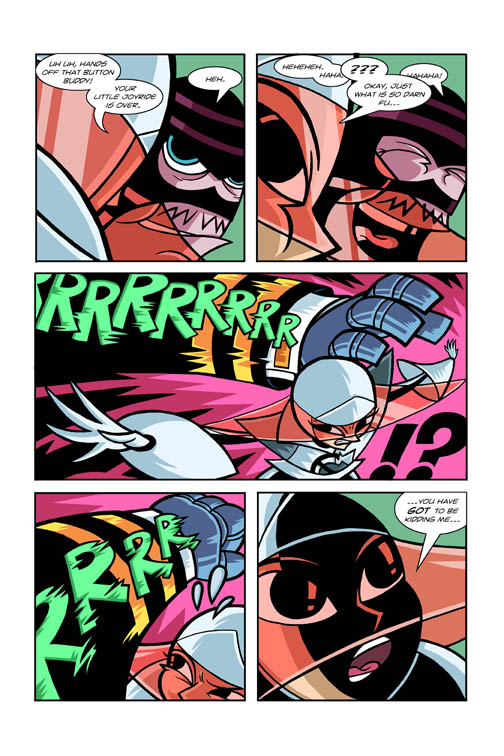
I originally intended the last panel to be a totally monochromatic orange color since it seemed to really emphasize the action. But while coloring, I found that because of the way I composed it, it would still work even if the only thing orange was the background. The green colors from the panel next to it seemed to help connect the action just as well.

Christmas is coming soon, so I think my output will probably have to slow down. Good night and God Bless! The Neverending battle continues! 

Thursday, December 08, 2011

My Comic Book: Page 17 WIP colors

Quick post tonight. Just blocked in the basic colors for this page.
Blocked in colors
A lot of the color scheme's already been figured out in my previous pages, so I just dialed this one in. Next step will be to add shadows and speed lines to help focus some of the important stuff going on in the panels.

Tuesday, December 06, 2011

My Comic Book: Page 16 final colors

Finished up the colors for page 16.

Work in progress

Final colors
I've been going bonkers on the coloring lately, ie. adding a lot of detail using color. So much in fact that I had to go back to some pages and tone down some things (some of my clouds are looking a little 'poofy' instead of angular for example). I have to remember to try to keep the detail simple and keep the look of the book uniform. This page helped me try to figure out that balance a little bit.

The large solid areas for color are tempting me to fill it up with color effects, it's really tough to resist the urge. Anyway, that's it for tonight... er... this morning! Good morning and God Bless!

Sunday, November 27, 2011

A ninja-shirt-birthday for my wife

Taking a break from coloring, I created a little design that I got printed onto a shirt using cafe press. I knew I wanted to draw her ninja persona from my wedding proposal comic around a year ago, but I honestly didn't know what kind of composition to go for. Here are some of my thumbnails trying to figure it out.

Preliminary sketches: I went with 3 one on the top row.

Still not really knowing a design, I went ahead and inked the character and tightened it up. I started trying to draw some tree by her feet in this weird 'fish eye like' perspective, but it wasn't working. It was too busy and called a lot of unnecessary attention to itself, and when you did look at it, you had no idea what it was supposed to be!

So then I started coloring in the figure and started putting a flatter background design. Just simple colors so the heaviest blacks (the character) would stand out. Also I opted not to tilt her in this composition. The tilt was just me trying to make a confused layout more interesting.


I was getting somewhere at this point but it just wasn't enough. The cherry blossoms and stars just just seemed so... loose. The pieces just weren't fitting together. After a lot of messing around, I found the best answer, was of course, the simplest one. I added the branches of the cherry blossom tree to ground the composition.


It's not perfect, but definitely better than what I was initially going for. It took a lot of me really messing around, but I got it done to a state I'd be satisfied with to present to my wife. I sent it off to cafe press and ordered it onto a tank top.


The color came out a lot more faded and a lot more CMYK-y than I'd like. Still the print version has a certain charm to it. The design's a lot lower on the shirt than I wanted too. Anyway, the wife loved it when I gave it to her! And that's all that counts right?

The Bomb Squad update: I've finished coloring page 14 of the book, and I'm onto page 15. I'll try to do another update soon. Good night and God Bless.

Sunday, November 20, 2011

My Comic Book: page 12 and 13 final colors

That Flu really kicked my butt. Been out of commision for so long, but now I've decided to just push myself to just get this spread done. I'm still not 100% but I'm good enough to finish up these pages. There are still a few things I'd like to mess with on the colors for this spread, but I really need to move on.


I had a more monochromatic scheme for the panels on the bottom, but adding a few splashes of color helps it along a bit without taking away from the main image.

My plan is to finish coloring the remaining pages by the end of the year. I'm not sure if I'll make it, but I certainly won't do it by nit picking everything to death! Onto page 14! Good night and God Bless!

Tuesday, November 08, 2011

My Comic Book: Page 12 and 13 colors WIP (round 2 and 3)

 Still plugging away on these pages. Caught a pretty bad bug (and still recovering), so I was out of commision for 6 days.

Going for simpler color scheme initially...

...but I seem to be headed for something more colorful...
I had wanted to keep the colors simple, but the more I kept working on it, the more I felt the building also needed color. It needed presence, to make it have more importance. I mean it is the thing the Bomb Squad's trying to save for an issue and a half now, right? Not quite done with the faces on the bottom, and not really sure about their color scheme either yet. I'll figure that out next time... the Neverending Battle continues! Good night and God Bless!

Tuesday, November 01, 2011

My Comic Book: Page 12 and 13 colors WIP

Not much color going on in this spread, but believe it or not I've spend a lot of time trying to figure out how this page will work!


It's still not quite how I'd like this color scheme to turn out, but I think I like how the bright yellow "EEEEE"  lettering is working with the red and blue.

Wednesday, October 26, 2011

My Comic Book: Page 11 Final colors

Finally finished up this page.

Aaaand, onto the double page spread (gulp)!
Related Posts Plugin for WordPress, Blogger...