Pages

Sunday, April 29, 2012

My Comic Book: Issue 4 Cover WIP part 3

...added some background elements to it. I think I'm getting somewhere with it, but it's not quite there...


I'll try to add the issue number and my name on it (like the other covers) and see how I feel about it then.

Thursday, April 26, 2012

My Comic Book: Issue 4 Cover (WIP) part 2


Just had a few hours messing around with some elements for the cover. I'm hoping to do it just in black and white and some grays, but we'll see what I end up with. Not quite that easy without color to fall back on...

Tuesday, April 24, 2012

My Comic Book: Issue 4 Cover (?!?) WIP

For those of you that read my blog, you're reading it right. This is a work in progress cover for issue 4. How can that be you ask? Especially since I haven't even started working on Issue 3??

Since I sent off my test print for issue 2, I've just been taking it easy. I decided to just draw for fun and started drawing the Squad's Chief.


And what do you know? I kinda liked it enough that I' thinking of using it as the cover for Issue 4. It still needs quite a few elements, but it's nice to work on it so early on. I usually work on my covers at the end of the sequential pages, but I always freak out when I get to them.

I get so caught up on trying to make it look great, and by the time the sequentials are done, I'm usually burnt out by then. So this was a refreshing change.

Still, who knows, I'll probably look back at it later and hate it. That's it for tonight!

Friday, April 20, 2012

Comic Book Ramblings!

While Issue two of The Bomb Squad seems to have taken over this blog (and my life), a loong long time ago I actually started this blog to gab about comics! So let me gab  real quick.

Let's start off with this: I'm a DC fan. So my slant is always going to be to DC and more superhero-y comics (kinda). So I've jumped on board like a maniac when the New 52 came out. 8 months in and I've dropped a few books, but there are still a few titles that tickle my fancy. And for the record, I believe DC's doing a good thing with this reboot. Not everything works, but they're trying new things. Unlike Marvel nowadays, which just does the same thing, but more of it. But later on that.

My Must Reads


  • Aquaman - Good, solid, fun Superhero action. I think this is Geoff John's better title currently (though I must admit I bailed out of Green Lantern after the first issue) and some solid artwork from Ivan Reis. Some good characterizations by Johns that some might feel slow, but I rather like it. Aquaman's one of the few new 52 rebooted characters that I feel I actually am getting to know and connect to better than the rest.
  • Batman and Batman and Robin - I promised not to buy Batman books with the reboot, because it SEEMS like the typical book to get, but these are some good stories. Scott Snyder knows how to execute a good story and Capullo's doing some good work and story telling (I was never a fan of his art). Snyder is now my favorite writer (It used to be Geoff Johns). I skipped Batman and Robin in the beginning, but would always flip through it at the store. I finally broke down and caught up to the series. Peter J Tomasi has great characterizations for Bruce, Damian and Alfred and the art by Patrick Gleason is solid; bold and brash when it needs to be and economical so he can maintain a deadline (It seems, at least, he hasn't missed an issue yet, when practically every new 52 artist already has, save for Capullo).
  • Saga - Brian K. Vaughn's back in his element with his latest 'road trip' stories. I think these are the stories he writes the best, with Swamp Thing and Y the Last Man being good examples. He builds a great cast of characters and a pretty fascinating sci-fi world. The artwork by Fiona Staples looks fantastic. A definite treat in both writing and art. Not for the kiddies though.
  • Swamp Thing - This is the better half of 'The Rot' storyline that is also being presented in Animal Man. The art by Yanick Paquette is pretty fantastic. Very illustrative work that reflects the old Swamp Thing titles that definitely ups the creepy-ness factor. Like a few of the books I've been enjoying, there's a good amount of character work that's going on in the stories. Yeah, Scott Snyder's my hero.
  • Wonder Woman - Definitely not for the kiddies and not your dad's Wonder Woman. There have been a lot of controversy with what Azzarello's been writing. But I must admit I've been enjoying it. Well put together, great redefinition of the Gods and solid art from Cliff Chiang (he kisks it up and extra notch in issue 8 it seems). A few people won't like what's being changed, but I say why not? This truly feels like an earnest effort on Azzarello's part to take DC's reboot seriously and keep readers interested.

The Promising Titles


  • Saucer County - A good mix of political intrigue and sci-fi. This has a pretty Ex-Machina flavor, and while I liked that series, I feel I like the characters a little bit better in Saucer County. This is the first time I've been exposed to Ryan Kelly's art and I've been enjoying it. A lot of talking heads, but pretty interesting so far...
  • The New Deadwardians - Cool alternate history England/vampires/zombie universe. Good writing and an art style that's a good match for it. I like that Vampires and Zombies aren't named 'vampire' or 'zombie', and really serves to disconnect me from my preconceived notions about them (Which is good since I'm sick of them!). Also it's played out more like a crime/detective story that just HAPPENS to occur in this alternate world. Looking forward to future issues.
  • Justice League - When Justice League first started I was really excited about it. But at the end of the first arc I was pretty disappointed. I didn't feel that Johns really gave the individual 'leaguers' a good voice, and so far this team hasn't really been gelling well (which I THINK is the point). I think I was expecting something else from the first arc. When I read it again, I understand now that this book is supposed to be the big summer blockbuster type title. Pretty splash pages and double page spreads galore. The past two issues (7 and 8) have been a little more promising, with Johns being able to flesh out characters a little bit better. Strangely enough it's NOT the actual team members but rather the supporting cast (Steve Trevor and Green Arrow). The Shazam backup is also looking promising, so I'll be back for the next issue. Still, if Johns fails me on the next arc, I might drop this title.

Getting dropped (but no hard feelings)


  • Animal Man - I really wanted to like something that Jeff Lemire wrote since everybody's raving about Sweet Tooth. But while his Frankenstein started out cool, I dropped that early. I felt that I kinda got what he was trying to do there and didn't really feel like following it anymore. With Animal Man, I feel his execution in defining the characters isn't that fleshed out, and it's already been eight issues. It's not a bad book, but I feel like it's really dragging lately and just waiting to catch up to the rot crossover with Swamp Thing. So I'll probably flip through it in the stores but probably won't be back.
  • The Manhattan Projects - Pretty interesting book by Jonathan Hickman about a team of geniuses (Including Oppenheimer, Einstein and Feynman) from the World War 2 Manhattan Projects fighting some crazy threats. It's pretty well-put together, though I'm not a fan of Pitarra's art, it looks like he's got a heavy influence from Geoff Darrow, but his characters and anatomy aren't as solid, and his finish is a lot more rough. I feel like it's going to be like an Authority-type book but with WW2 rocket scientists, and granted that should be pretty interesting, but I don't really feel like reading that. I'm probably wrong and Hickman has something else lined up, but I think I'm dropping this. I'll flip through issue 3 at the store and see what happens.

Dropped (with hard feelings)


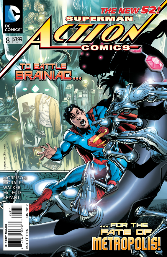
  • Action Comics - Superman is my favorite character. But!  Grant Morrison is not my favorite writer. In fact, he has quickly joined the ranks of Jeph Leob and Brian Michael Bendis as writers that I will always keep away from. I'm tired of working so hard to understand Grant Morrison's writing. I feel he never makes me care for any character in a lot of his writings, so when things happen, I don't care. I don't care about his Clark or Superman, and I feel he dives straight into the crazy Superman stories without grounding him well or even letting us get to know him in the first few issues. The first arc's execution is so disjointed and the tone swings too much. I liked the first 3 issues, but it quickly becomes messy storytelling later on. I think Morrison has some great high concept ideas, but he can't tell a story. So I'm out of this one. Side note: I re-read Final Crisis recently just for kicks and that solidified my decision, I am steering well AWAY from anything Morrison writes.

Not even bothering to pick it up


  • Avengers Vs. Xmen - Comic Book readers keep complaining how they want something new, how everything's just the same ol' recycled story. DC reboots their whole line, bringing out a few alternative genres of horror, war, western as well as revamps on their superhero titles. Not everything's a hit but hey it's something different. And how do internet sites and fans react? "Oh man, it's not my Superman! What did they do to Wonder Woman? Why are they doing the same old crap from the 90's?!" And while some of the criticism is valid, I think the reboot is a step in the right direction. And Marvel's answer to this? They add more multiples of their EXISTING titles. More X-men books, more Avengers books, more Spider Man books. Their big event is one superhero team fighting another. And guess what? Fans LOOOOOVE it. Marvel's pumping out, LITERALLY the same tired old crap and orders are going through the roof from retailers. Really? Really people? Really?!
The comic book industry is really flushing itself down the tubes because it's simply targeting the same market: old dorks like me. A lot of these titles I mentioned aren't aimed at young readers. They're still aimed at the dudes that grew up reading them in the 80's (or older). Why would a kid pay 2.99 - 3.99 for a book when a cheaper, 99 cent angry birds game will provide hours of more fun?

Meh.

I'm going to end the rant, other, better writers have gripped about this issue already. But when a series like Avengers Vs. X-men gets so many readers (let's face it, these are the same ol' readers not new ones) excited and shelling out their money, it really depresses me about the state of my favorite medium.

Sigh. That's it for tonight. Here's hoping the Neverending Battle never ends. Lemme go read some Will Eisner so I can feel better.

Thursday, April 12, 2012

My Comic Book: Cheat Page revisited

I had a couple friends of mine read through the second issue's test print and what came out was that the flashback sequence had a confusing read to it. They didn't understand who was having the flashback, or rather the read of it was confusing.

The old version

Revised version

The easy solution was to replace Bomb Girl's face on the 10th panel with the Kid's.

All the little changes I've wanted to do for this issue are done. There are some that I've just chosen to let go and just get this thing done and move onto issue 3. I still have to flatten the files and it's off to the printers! Good morning and the neverending battle continues! 

Thursday, April 05, 2012

My Comic Book: Issue 2 Cover WIP part 7

Neverending battle indeed!

After staring at the cover a little bit more, I wasn't quite digging the shade of blue that it was in. I think the lighter jagged lines I added made the overall shade too light. Anyhow, here's the next iteration with punchier blues added.


The funny part? Those same blues are probably not going to reproduce too well when it's in print! Good morning and God Bless! Easter is coming!

Tuesday, April 03, 2012

Friday, March 30, 2012

Thursday, March 29, 2012

My Comic Book: Issue 2 Cover WIP part 3

I just got jazzed again this morning to work on the cover (instead of playing video games!). While I did want to get through Vanquish on my XBOX, I am not going to pass up the muse when it beckons!

Where the heck does the logo go?!

Cleaned up some of the lines this morning and went ahead and blocked in some colors. I think I still have some composition and detail issues I want to address, but I think it's coming along. Okay gotta go! I'll be late for work!

My Comic Book: Issue 2 Cover WIP part 2

I'm still trying to push through all my daily distractions and did a little bit of work on the cover.

slowly but surely!
I've been inking the background elements of the cover as well as fixing up the foreground character bit-by-bit. I'm also messing around with the logo placement. It looks like the top left corner of the cover is BEGGING for something to be placed there, but I always pictured the logo to be in the sunglasses...

I'm going to mull it over for a bit... but that's it for tonight, I'm beat! Good night and God bless.

Thursday, March 15, 2012

Thank You Cards

I have absolutely come to a screeching halt with my comic book.

It's very sad. I keep justifying my 'stalled' predicament by thinking, "it's okay, I've been working hard to finish the colors... I only have a cover to do... I need a break". And that's where it gets dangerous.

When I don't ride that artistic momentum, it's really hard to get it back again. Kinda like excercise. You get into a groove, and it becomes 'easy'. BUT, you miss even one day from your regular schedule, and it's so hard to find that groove again.

Sigh. Anyway, my blog is looking sad, so I thought to post something up.

This is the thank you card I did for my wedding. Still going with the comic book theme, I whipped this up relatively quick ('quick' for me at least). Unfortunately it's been taking me and the wife a LONG time to send them out!

I can't find any physical sketches of the thing, so I think I did it all digitally. Sorry about the way I laid out the images; it's a little weird, but the top half is actually the inside of the card and the bottom half is the front.


Rough digital pencils

Trace-worthy background reference!

inks

flat colors

First color pass

Final Colors
For the background, I just googled up our hotel and traced one so it would fit into the cartoony world of the characters. What can I say? I'm lazy, slow and get even slower when I do backgrounds. I had to do this card quick. I knocked the linework for the building back, so that the characters would pop-out more.

My initial color pass had gradients in it, but I felt like it was trying too hard. I didn't like the colors when it came out in print, and I felt the gradient wasn't really adding much. So in my final color pass, I left the colors very flat.

I was also experimenting with a caption at the front of the card, but I think it took away from the image and opted to get rid of it entirely at the end.

That's it for tonight! Here's hoping I can get my groove back and really put issue #2 in the can! Good night and God Bless!

Sunday, March 04, 2012

My Comic Book: Issue #2 first test print!

Yay! I got the test copy for Bomb Squad #2 in the mail last week! Sorry for just dropping off the posts, but after coloring and sending off the files to be printed I just stopped to a halt with my comic book work! I got sucked into video games again (I've been sucked into Yakuza 4, Binary Domain and Rhythm Heaven Fever lately!)

Anyhow, the print came back, and I am so excited! The paper quality's better than the first run of the first issue, but the color ink seems a little sparse, it's not QUITE a solid color when it's laid down on the page. Still it's a nit-pick; the book looks pretty sweet in print and in my hot little hands!

Temporary cover. I need to get a-crackin'!

The first two page spread looks like it's working. Still I need a few color
tweaks on the highlights on the window in the panel with Kid Hotshot.

This page is almost there, the highlights on the building need a little tweaking as well.

It's nice to see some of the colored pages when they're side-by-side like this.

The print is a little strong on the blue, the sky is supposed to have a little more green and some of my really subtle light tinted grays aren't picked up, so they just go to white. I'm actuallu using the same chade of blue for the sky in the first book, but they turned out pretty different. Still, I like the print from Ka-Blam. I'm excited to finish off the cover and sell it at a con! But the only cons (close to me) are A.P.E. and Wondercon (if it comes back to SF) next year!

I need to get back into the regular groove of working on the book again, then ride that flow into issue #3! The idea was to do a book a year, so I'm already late! Story of my life! Seeing my book in print though always gives me a second wind. God Bless you all, and see you next post!

Friday, February 17, 2012

My Comic Book: Issue 2 Cover WIP

I kinda had this idea for the second issue's cover where Kid Hotshot is standing really close to the viewer. Like a fish-eye lens shot type of thing, with the rest of the squad standing behind him. But it just wasn't working. So I kept doing more and more thumbnails, trying to get my idea to crystallize. I still don't think I'm there. However, this is what I arrived at:

initial sketch - kinda neat, but the logo area is too small

cropped it a little different and cut up the legs to force the perspective
So after that, I scanned it into Photoshop and drew on a separate layer using a red color. Once I got some of the loose linework in there, I jump over to the inking side of things. I jump from the red lines to the inks and cutting and pasting stuff to get it to the composition I'd like.

Still workin' on it...
 I'm still not sure where my composition is heading, but working digitally really loosens me up. I don't feel afraid to make a mistake. Anyway, that's enough outta me! Goodnight and God Bless.

Monday, February 13, 2012

Adopt a Rainforest

No posts on my comic book today, just kinda taking it easy before I dig back into it and draw the cover for the second issue.

So as a 'filler' post, I dug up something I worked on awhile back. I freelanced a bit for a company called LOLapps on a facebook game called "Adopt A Rainforest". I don't think it's up anymore because A) the landing page on Facebook only said it had 10 active users a day and B) When I try to connect it just gives me an error message!

This was my second social gaming gig I think, so it's interesting for me to see this body of work nowadays. I produced a lot of assets for the game. Come to think of it, I think I produced all the assets for it! But before I get into that, let me start at the beginning: it started out with a test.

I was given some character design parameters and look that LOLapps was trying to go for with this new game they were developing. I can barely remember what the parameters were, but this is what I submitted:


I have very little knowledge in working with Illustrator or Flash, so I did this guy in Photoshop. Luckily, the client liked what they saw and I landed the job. I recall that they were hiring other freelancers, but I think they must've settled to use just me (I could be wrong). Of course if I had known I'd be the only one producing art for this game I think I would've freaked out and not done it at all!

Anyhow, I produced a bunch of work and all of it was done after my regular job. So I would usually clock in another 3-4 hours a night extra once I got home. It was VERY tiring, but I must admit it was also good experience. I was producing, I think, 1 of these assets within 30 mins. I think I was averaging 45 mins to an hour per asset. The client wanted me to work faster and they seemed pretty happy with what I was producing...

Animal Character Designs
I think the fact that I worked so fast was stressful, but also very fun. I clocked my time, and budgeted what I could get away with with my schedule in mind. I think that disciplined me a lot to not dwell and move on to the next one. Admittedly, they're not all great designs, but there are maybe a couple in there that I still like.

Events
I learned alot about color and silhouettes with this project. Because I was working at a small size, I had to make sure things were clear and distinct.

Supplies
After these submissions, the client asked me if I could provide a background that all this art could reside on. I wasn't really thinking of backgrounds when I generated the art, so that was a little difficult to design. Backgrounds aren't quite my strength, I'm afraid. Still, it turned out okay.

Background
When I saw the game in action however, I wasn't quite that pleased with how they interacted with each other. I guess I didn't really plan ahead in how these things looked together.

Later on they asked me to generate a banner for them too. Of course I wasn't that great of a graphic artist either, but I dove in for that assignment as well anyway! Here are the designs I came up with: 


The last one ended up being the final comp that they liked.

It was pretty tough maintaining my day job and this at night. I was pretty tired, so I was quite happy once I shipped off the last of the assets for this game. While the freelancing gave me some great pocket money on the side and  invaluable lessons for my art, it was quite tiring. I don't thtink I'd be able to handle something like that anymore!

That's it for this post! God Bless and good morning!

Wednesday, February 01, 2012

My Comic Book: Mock up prep

All pages of issue number two are done!

Now, I'm going to do a test print with a mock-up cover and send it off to Ka-Blam to print. However, I'm not completely done: I still have to prepthe interiors and do a cover. But this test print will help me take a look at how my colors will come out. Here are the mock-up, inside back and back covers.

Mock-up cover

Inside front cover

Back cover
Tomorrow, I'll start cutting up the pages to the right size and getting it ready to upload and place an order in. Boring stuff, but it's a nice feeling to get my pages in order. The neverending battle continues!

Wednesday, January 25, 2012

My Comic Book: Page 23 final colors (cheat page!)

Creating comic books is such a giant mental challenge. Locking yourself away to write, draw, ink, letter and color takes it's toll after awhile. It's so easy to procrastinate or make excuses after a tiring day at work.

When I work, I find that if I do little countdowns for myself on how many pages I have left to finish, it helps push me on. I usually have a couple pages in the Bomb Squad that I know should be easy for me to color. I usually color those last, like a mental ace-in-the-hole that I bust out when I'm starting to get fatigued. Does that make any sense?

Anyhow, this is one of those pages...


Fortunately, this page works with the simple monochromatic color scheme to signal a flashback much like in the first issue. And that's it for tonight. And that brings me to...

2!

more!

pages!

left!

God Bless you guys and good night... er, morning!

Related Posts Plugin for WordPress, Blogger...