Pages

Tuesday, June 11, 2013

Superman's 75th: Cartoon Art Museum Exhibit part 1

My Superman 75th anniversary celebration continues!

This past weekend I took my daughter to the Cartoon Art Museum in San Francisco and looked at the Superman exhibit they had up there. I took a ton of photos to share with you all, but no flash photography was allowed so some of the photos may be a bit blurry and out of focus. Also, there isn't much to an order to the way I shot these photos, so bear with me!

The main Superman Exhibit's room at the Cartoon Art Museum in SF.
Also, I had my 10 month daughter strapped onto me with a baby Bjorn, so it was tough to take a steady picture! She actually kept bouncing up and down whenever the large Superman mural was in her eyesight! She wanted to keep touching the mural and had a lot of fun seeing the bold colors on it.

Pretty awesome reproduction of the classic Superman pose.
My baby would be very vocal and wanted me to keep
bringing her back so she could touch the mural! Sniff! I'm so proud!
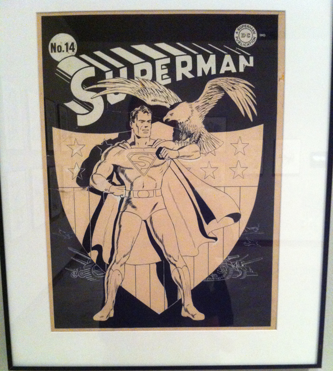
The exhibit has original artwork from quite a few points in Superman's comic book history. And it's interesting to see who the artists were that generated some images that I recognize from even before I was reading Superman comics. One of whom was Fred Ray.

Art by Fred Ray.
Art by Fred Ray.  
Art by Fred Ray.
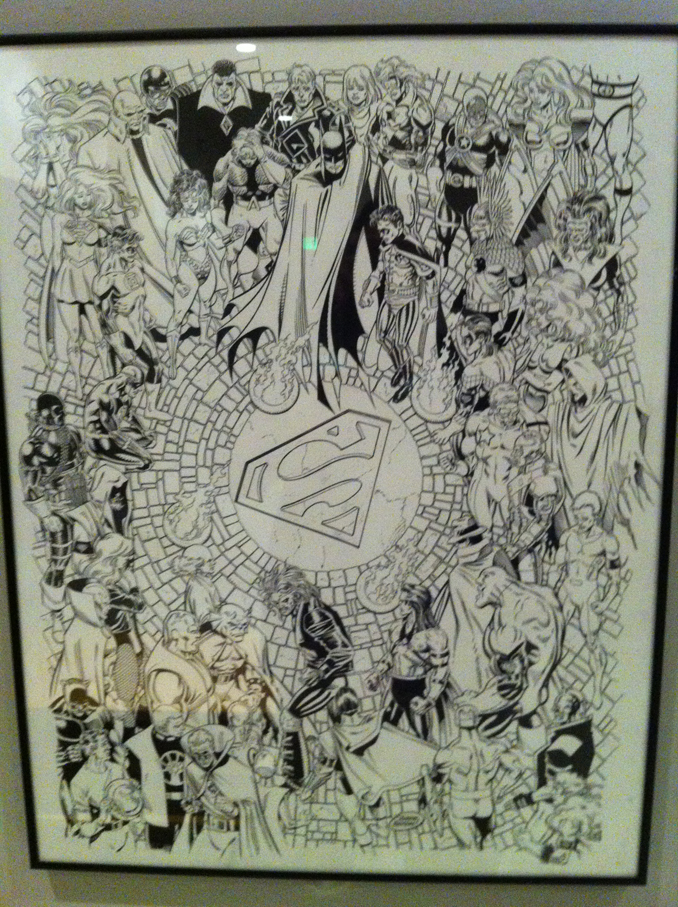
I always thought Joe Shuster drew the images above, but that's what I get for not knowing my Superman artists well enough! Next up was artist Jon Bogdanove's pieces. He does a few homage drawings in these pieces, and they look really excellent.


Sketch detail from the image above. Looks great!


Curt Swan/George Klein inspired turnarounds for the 50th anniversary statue.
Sorry this is a little blurry!
The next three pieces were a treat to see as I've never seen Curt Swan originals before. I know quite a few people don't like Swan's work because it isn't dynamic, but the man sure can draw! I always have fond memories of when he and Elliot S. Maggin wrote Superman stories. I honestly haven't read that much, but those stories have stuck in my head to this day. I'll try to review them in a future blog post!

I think this is a Curt Swan piece, I can't remember what the title card for it said.
I do miss these "dun-dun-duuun" covers!
This next artist, I didn't think I'd see in a Superman exhibit, but was very pleasantly surprised when I did. I guess it makes sense since Kirby did have a few Superman related runs when he was at DC. I even rememeber seeing him draw that DC Super Powers book way back when. I'm a kirby fan, but when he paired up with Superman, it just didn't seem... 'right'. The Jimmy Olsen stuff however seemed right up his alley! And come to think of it all of his other creations at DC were just fantastic!

A page by the king, Jack Kirby.
 In the room next to the main one, there was movie and TV related paraphernelia.

Brandon Routh's costume in Superman Returns.

I never got into Smallville (gasp), but I believe this was from the show.
I think these were from Smallville too.

Poster from the 1978 Christopher Reeve
movie. I was 2 years old when it came out!

Man of Steel Production art by Peter Rubin

The next pieces were fun to see as they were when I was really getting into and reading a lot of Superman comics (John Byrne reboot, death of superman and afterwards). So this batch of art was a real treat to see. I actually still regard the Return of Superman (not so much the death) as one of my all time favorite 'mega-events'. This was in a section of Mike Carlin's collection.

Denis Rodier's painted cover for the memorial edition of Newstime.

Jerry Ordway original art along with a print version.
I think I may still have this issue somewhere in the Philippines.
Krisis of the Krimson Kryptonite! Clark Kent proposes to Lois Lane!

A better shot of the original inks.

A Jerry Ordway Guache painting entitled "Superman for Earth".

Detail of Superman's face, Sorry it's blurry.

Mike Carlin did a thumbnail for the cover proposal of this issue.
Lex Luthor 'tee-hee-ing' on the bottom right panel is pretty hilarious.

Kerry Gammil and Dennis Janke's black and white piece.

And the final cover. I remember the "Hostile Takeover"
backups that feature Lex Luthor too. If I remember right,
it's about what he does while he's not messing with Superman.

Gouache painting by Eric Peterson for the Man of Steel
Platinum Trading Card collection. Mike Carlin narrowly avoids
getting a car smashed on him in this take on the classic cover for Action Comics #1

Another Kerry Gammil/Dennis Janke cover. I don't remember this issue,
but I do remember the "Time and Time Again" story arc fondly. Getting
an excuse to put modern day Superman into World War 2 was pretty cool.

Superman punches Doomsday in the face! Jon Bogdanove
really knows how to deliver some action packed sequences.

Death of Superman poster by Dan Jurgens and Brett Breeding.
 Here's another artist I didn't think I'd see at the exhibit. I don't think I actually read this issue, but I do vaguely rememeber Walt Simonson drawing some Superman while he was at DC too...

Walt Simonson page from The Legacy of Superman #1.

A Tom Grummet and Doug Hazelwood original from
Adventures of Superman #500. Another page I don't rememeber...
Am I going to have to buy that Death of Superman Omnibus to refresh my memory now?? 

Jackson Guice's cover sketch. I loved seeing this.
A blurry detail of the sketch.

The final inks.

Woo! Okay, that's quite a bit of photos to chew on! Let's take a break for now... I'll post up the rest of my photos (and I have a LOT more of them!) from the exhibit next time! The Neverending Battle continues!

Sunday, June 02, 2013

Happy 75th Birthday Superman!


I finished up my Superman Pin up just in time for his Birthday this year! My favorite hero of all-time! Sure I had a Batman phase when I was a teenager, but the older I get the less... Batman... I am (?) and the more Superman I want to be! Not sure if that make sense!

Thank you very much Jerry Siegel and Joe Shuster for creating a great character!

June will be my Superman celebration month. To kick it off, I've already nerded out and bought this:
No one can beat Jose Luis Garcia Lopez's art
And I also have this along with that order:

The wife and I are really going to try to get a sitter so we can watch the upcoming Man of Steel film by Nolan/Snyder and I'm taking my baby girl to the Superman exhibit they have up at the Cartoon art Museum. I'll also continue to buy the digital weekly versions of Adventures of Superman, and will make sure to visit the comic shop when Superman: Unchained hits as well!

I'll try to dust off some old Superman comics I have and re-read and maybe post them up here to share.

So Happy Birthday Supes! And here's to 75 more years of neverending battles!

Saturday, May 18, 2013

Cartoon Art Museum

The Chefville art team (That's the team I'm on)  was given the go ahead to do an offsite and visit the Yerba Buena Museum. While that was a pretty cool museum, after that, we all decided we wanted to hit up the Cartoon Art Museum that was a couple blocks away. And of course, I had a blast in there!


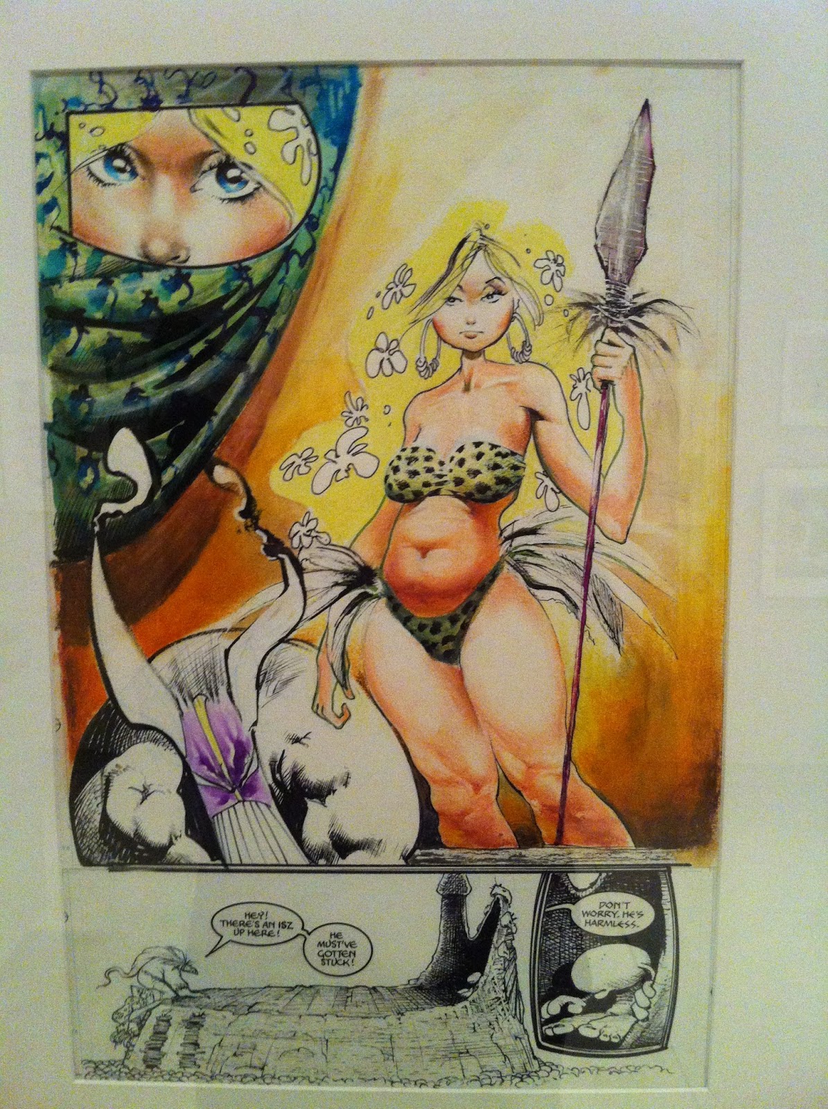
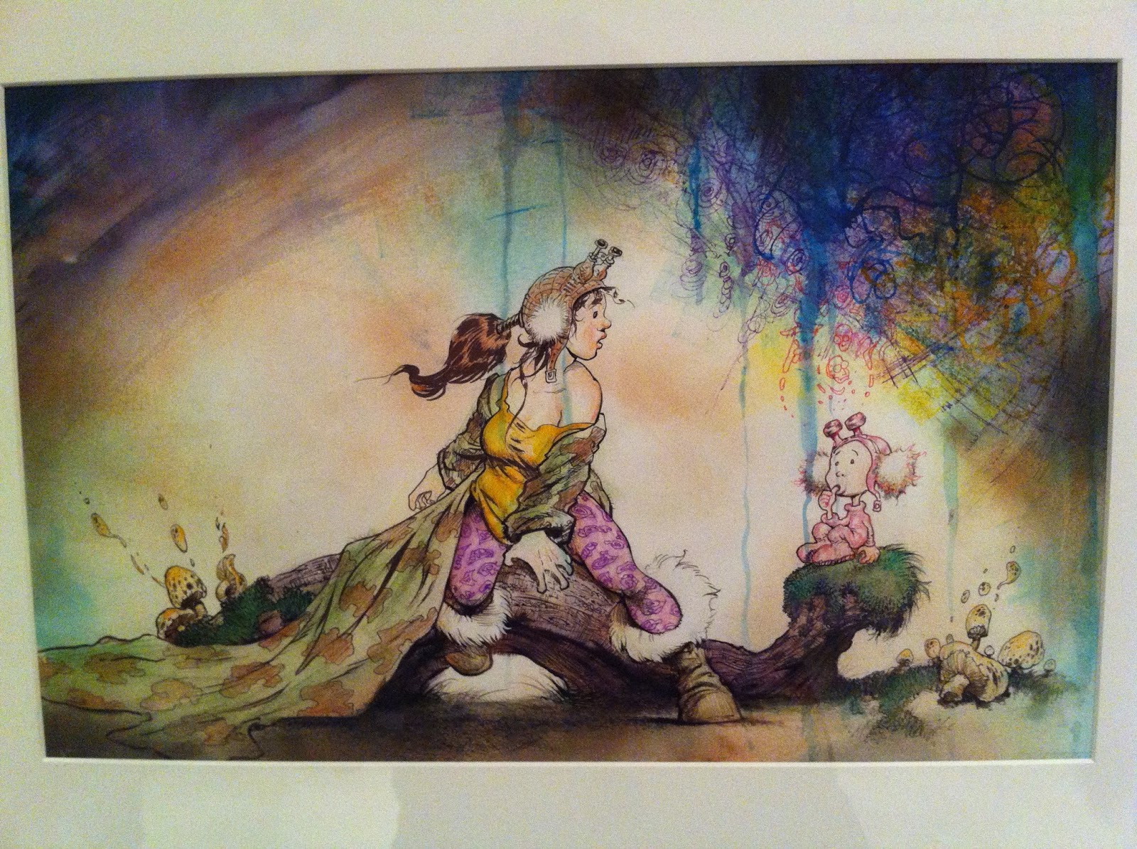
At the time we visited, they had a Sam Kieth exhibit up. It was nice to see his stuff up close. It's interesting, because I have a few books with his art in it, but somehow I just never appreciated it as much as I did when I saw his actual art. Don't get me wrong, I like his stuff, but seeing it in person is certainly something else.


I have a few issues of the Maxx, but you never quite see the
energy he puts in applying the paints with the printed material.


This is a close up of a two page spread. I love the hatchwork he used in the face.
Always good to see inkwork at actual size.
Nice use of solid blacks and hatching to give a nice range of tones.

There's a lot of texture going on in this painted piece.
I think it's his personal work, but I'm not sure.  Creepy cool.
In the rear of gallery they have a few of the permanent pieces (at least I think they are) on exhibit. It was a nice collection of some great work. It's very interesting to see some of the newspaper strips up, and just thinking about it from a production standpoint makes me appreciate it even more. Like for instance, the economy of line, the set up and the punchline (for the gag strips), all within 3 panels, and the stress involved to deliver the work at a daily pace. And of course, it also has to be good!

Walt Kelly's Pogo strip original inks. His lineweight and hatchwork is killer.

Hal Foster's thumbnails for a Prince Valiant strip. Great to see this part of
the production before he goes into the final piece. Even his 'people blobs' on
panel 3 look great!

I have always wanted to be able to create a rogues gallery as awesome as Dick Tracy's.
Chester Gould had that best character designs. It may have been for a deadline, but I love seeing giant
spots of black on a page. It just makes inks look so much 'fuller'. Look at how giant that text is for legibility!

I always read Blondie when I was a kid and I think I watched
the live action black and white re-runs on TV too. I always did wonder why
Blondie married that goof Dagwood Bumstead! And he's just being mean in this strip!

Always great to see a Will Eisner original. Loved the shadow of the
glass signage casting itself on the Comissioner Dolan's trenchcoat.

I vaguely remember reading these in a collected edition in a
library in a golf club in Alabang, Philippines. I remember liking the
art for Alley Oop, but I cannot remember anything that happened in the strips!

I have no idea why, but it's only when I saw this panel from
George Herriman's Krazy Kat did I realize that that's the style
Art Spiegelman was going for in Maus. Or maybe I did know, I just forgot? 

I loved seeing this color guide.
A bit blurry. I've never seen a Watterson original before this.

Detail of the watercolor work he did for the cover. Very clean application
and such nice subtle shifts in color. I always  loved his choice of colors.
And way in the back of the museum, there's a looney tunes/ Chuck Jones exhibit. And looking at some of his stuff certainly makes you feel very small as an artist!


Detail of the gradient of the light on the floor
applied in Guache. Pretty awesome craftsmanship. I
REALLY sucked at Guache in school so I really feel
super, super tiny when seeing how great it's applied in this piece.
This is a great sketch.


And finally in the main gallery, there's a few contemporary artists pieces being displayed for limited time as well. One of the artists in it, Roman Muradov, I've actually bought one of his comic books at some store in Japantown during a festival. I think he was the one who actually sold me the book, but I wasn't expecting anything when I flipped through his book. Anyhow, my mind was blown! His stuff is great.

A piece by Roman Muradov.
I've actually been seeing his comic books all around town (In San Francisco) on the indy racks in comic book shops as well, as I'm trying to figure out local places that can carry my books.

I See what you Say by Christian Robinson.

Sadly, I cannot remember the title or the artist
of this piece, but I dug the colors and the shapes of the animals.

Elenor Davis' Talk to ME, Not to My Daughter. I'm
always a sucker for a  nicely applied complimentary color scheme.
Uhhh, look no further than this Blog's header image to see what I mean!

A splash page by Eleanor Davis with Drew Weing.
This is from the Secret Science Alliance and the
Copycat Crook. I'm going to have to pick up a copy of this book!

Aaron Reiner's A Strange Storm from Night of the
Waxing Moon. Sorry it's blurry. I can't seem to find this book on Amazon or
Instocktrades for order? Maybe I have the title wrong. Looks great nonetheless.
 And finally, in the room next to that gallery, the room was blocked off, but I saw this:


Noooooooooo!!!!! The Superman exhibit wasn't up yet! Gah! Apparently it's up NOW. I'll have to make the pilgrimage there sometime next month for Supes' birthday.

And that it for tonight in San Francisco. good night and God Bless. The Neverending battle will continue!

Sunday, May 05, 2013

Free Comic Book Day and Superman: Unbound

Free Comic Book Day has come and gone, and I was able to take my daughter to her very first one over at Two Cats in West Portal, San Francisco. It's not my regular Comic shop but it's close by and easy for me to get to. A buddy of mine lives close too, and since it's been hard to meet up with him B.C. (Before Child) it seemed like a good place to go.

The store was pretty packed, and not quite as many kids as I thought were there (just old nerds like me). I saw some kids come in, but they didn't really know what to get. I think Spongebob was the closest property they knew, but one of them didn't really know what the Ninja Turtles were (which is odd since they just relaunched). They definitely had no idea what the smurfs were.

I always wonder, with kids that are soaked in TV and ipads all day, how do I make a comic book worth their time to actually sit down and read? How do I compete with something like that with my own comic?

Here's the swag I decided to pick up. Only one of them is from the official FCBD line and the other two are extras from their stock:


I haven't read all of them yet, but I finished Batman Inc #1. I've never been a fan of Grant Morrison's stuff, but maybe because the stuff I read from him isn't usually a Batman comic most of the time. All-star superman may be the only exception of a title that he did that isn't Batman, that I liked.

Anyhow, it's a good issue that is tied very much to the initial series before new 52 (I got all of them when the price was lowered to 99c each digitally and it's a good read). So that was a score of a freebie. I'll probably wait for the trade to come out the get the rest. To newcomers, it might be a lot confusing to jump into this without reading the first series.

I just started reading through the first few pager of The Strangers, but I'm already a little distracted by the story telling. Some of the panels and layouts of the scene I wish were a little clearer in that opening action sequence, but I still 'get' the flow, so no harm done.

I haven't read through Fantastic Four 600 (SPOILERS! I believe the Human torch comes back in this issue), but it's a beast of a book 100 pages! I couldn't resist grabbing it.

Okay, switching topics now!

I recently watched Superman: Unbound, Warners' new animated feature featuring the man-taking-over-Bruce-Timm's-shoes James Tucker directing it. I really liked Tucker's work on the Batman: Brave and the Bold series so I had hopes for this movie as well as Tucker handling the producer roles that Timm did.

Okay some spoilers follow, but not really giant plot spoilers... be warned!

On my first viewing of Superman: Unbound there were some story bits that nagged at me. Little things here and there, such as Lois' character in the way she pressures Clark about their relationship, or getting angry at Clark for getting back at Lombard. The language Superman uses (I guess I'm kinda old fashioned and I never want to hear Superman say: "Go to Hell", Lois flippin' the bird and an odd decision Superman makes when battling Brainiac. Oh, and some weird thing going on with Superman's placement when Brianic shoot a beam from his Brainy-ship.

However, I find I've been relentlessly watching this movie over and over and over. Especially having it on while I'm working, and I must say it's really growing on me. The things about the plot that nag me are still there, but for some reason I forgive it more. Lois flipping the bird is actually what Lois would do, and seeing Lois and Clark argue like a couple is a fairly unique decision that we don't really see often. I didn't realize that the movie is PG-13 so it's not aimed at kids but rather teens. So while I have my qualms about the movie I think it's still a good approach.


The movie also changes a few things from the original run (which I re-read after my second viewing of the movie). In my opinion, Geoff John's original arc is better. I can see why they would change the ending (kinda), but I thought it was a very good way to really show just how formidable of a foe Brainiac could be. The odd decision that superman does while battling Brainiac on his ship in the movie, doesn't exist in the Geoff Johns story and there's also a cleaner solution to how the plot progresses. Also the Lois and Clark dynamic is handled much better, with Lois actually being VERY cool when Clark is pranking Lombard back. Oh and Johns is able to flesh out the supporting daily planet people much better than the movie does.

The movie also has a lot more Supergirl and a lot more of Superman getting whupped down. If anything Supergirl seems like a stronger hero than Supes (and that's not a big deal to me but when you name a movie SUPERMAN: unbound it'd be cool to see him be a little more kick butty).

The voice casting and acting is excellent, and Matt Boomer does a great Superman. I really dig the character designs and Superman and Supergirl look great in the film. The color choices (Krypton's especially) and the action sequences are a lot of fun. Supergirl is a great character in this film. She's the angsty new 52 Supergirl, but they really make her work well in the film and you understand just how she is her own person apart from Superman. There's also a little Lois/Supergirl 1 on 1 that's played well.

I still think Superman vs. the Elite may be my favorite Superman WB Movie. That story had good superman elements in it and sucked me in enough that I didn't have time to question the plot progression that Unbound did. However, I tend to lean towards the art direction of this movie more than that one.

Still, a good movie all in all, and it must be doing something right if I keep watching it over and over, right?

I'm saving up for next month, on Supes' 75th anniversary. I think I'm going to go all fanboy and buy a lot of superman paraphernalia! Okay that's it! 

Up, up and away!

Wednesday, April 10, 2013

A Super Break: Getting ready for his 75th!

Life has been nutty recently: just a lot more of it and a lot less time for myself... or too tired to draw when I do get some time! Whatever! Suck it up Bautista! Let's get to this post!

Superman's 75th anniversary is this year (and coming up in something like 2 months?), so I wanted to draw a pin-up for it. At the rate I'm drawing and posting, I KNEW I had to get started on this early. In general, I've been practicing on drawing Supes for awhile so this pin-up kinda reaches way back I suppose.

I started sketching out Superman's face. Trying to get a feel for it, until I come up with something satisfactory. And while other artists just get their doodles out perfectly, I am quite the opposite, almost all the time. Nothing comes out looking remotely great. I call it pooping on paper.


There's no possible way I can get it right the first time. So to work around that, I just draw a bunch of drawings (poop!), hoping that with each iteration (pooop!), I'll get close (poop poop!). I never really get THE one perfect drawing... Just get maybe real close, so it's not sa horrible mess! Sorry for the gross analogy, but after having a baby, anything related to poop is totally normal.

Once I'm close with his face, I start to work on his pose. It's the same process, a lot of misses but, at least for me, very necessary. Here's a digital sketch of me trying to still figure out his face and just pushing forward with a pose even though I hadn't worked it out yet.


So that was a sketch pose start and fail. However, I think the look of his face was coming along further this time around. I go back to the drawing board and start sketching more poses.


I liked how that bottom right corner one looked, so I decided to start fleshing that out in photoshop.


I tightened up the details of his arm a little in the sketch. Then started to ink and make up the details along the way. I put him in his new 52 outfit. And to tell you the truth, I think it's actually growing on me, lines and high collar and everything!

Supes Saluting and looking off to the right. At what? At this point I didn't really know...
After the inks, I started thinking about what background to put and instantly Superman flying in space popped into my head. So I googled up some earth in space pictures and proceeded to try working it into the image. However, I found after adding the blackness of space behind him, that element didn't seem to work. Also Superman always struck me as a brighter, daytime character anyway, so I decided to change it a bit.


I added some basic colors that were pretty bright. And I was messing around with some effects for the sky.


The sun rays weren't quite working but there's something about the beams that I initially liked. The straight angled sun rays seemed to compete against the curvy background. I switched it to be more like speed lines that went with the curve.


That's where I am so far. My final post for this won't probably be until June, in time for Supes' birthday. That's it for tonight! I am TIRED! Good night and God Bless!
Related Posts Plugin for WordPress, Blogger...