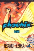
 I really should be better at updating this blog! The initial idea was to actually pop in every now and then after "comic book day" (ahhh those lovely Wednesdays!), and do a little rant on the titles I picked up. Alas real life tends to cramp this plan a little, so now my next post is 2 months later! Anyhow, I just wanted to spotlight some books I've been picking up from one of my favorite artists: Osamu Tezuka
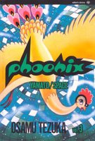
I've always been a fan of tezuka's Astro boy since I was kid. And I believe seeing the end credits where Astro ("Mighty Atom" for the purists out there!) is slowly being animated frame by frame made me want to jump into doing animation! Suffice to say, I've picked up the classic series (the color ones not the B&W) as well as the recent revamp DVDs. I've always thought that Astro Boy was my favorite work that Tezuka ever did. It was just such and amazingly fun concept, fun world and his designs were so solid.Then Lo and Behold, I finally got a chance to start reading Phoenix.
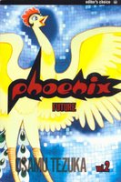
Wow. This series is absolutely stunning stuff. From The scope, the depth, the amazing art to the utterly genius layouts that Tezuka employs in the service of his story, it all knocked my socks off. Really. My socks. Off. At first I didn't want to read it because the character to me looked like a chicken version of betty boop. I'm a fool! Tezuka's ability to tackle different genre choices, character types and storytelling pacing is showcased to the fullest in this series. The Astro Boy comic books have nothing on how the Phoenix books are composed and laid out. Tezuka is given free reign in this Graphic novel format, so he can eat up as many or as little pages as he wants in order to slow down and speed up the action, mood or emotions he wants to convey. Add to this is Tezuka's impeccable draftsmanship and compelling stories and you have a killer series of books. I've only read the first 3 graphic novels, and I'll be sharing some of the pages here with you (so watch out! Spoilers!). First, I'll give you a quick summary of what the 'Phoenix' series is supposed to be about. Sorry if I geeked out so early, you probably have no idea what I'm geeking out about!
It's mainly supposed to be Tezuka's life's work. The story spans from the early, early beginnings of Japan's History all the way to the very very far flung future, where humans have colonized outer planets. Tezuka gets ambitious and every book actually jumps from differing time periods. The first book starts at the very dawn of Japan, then the second book occurs at the end of the world. As the series progresses, he keeps alternating between past and present until finally at the end, the series is in modern time, tying all the plotlines together and painting the big picture. Sadly, I read somewhere that Tezuka passed away before he finished the series (He finished twelve of the books... and that's incomplete???).
Tezuka's character designs are so good throughout this series, I definitely will have to swipe some of them! His influence is so strong in modern day Japanese pop culture,
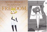 it's hard not to catch glimpses of him. Check out this design on the right from a Japanese Playstation 2 game called Remote Control Robot Dandy SF. (on the right is the video game design and on the left is a snippet from Tezuka's book)
 Take a look at the girls' anatomy from her thighs to her foot, how they just almost taper to a point. Very similar treatment in Robot Dandy's girl character. Also the very delicate hands and the nice graphic hair, all traits Tezuka nails solid, is very evident in the character designers choices in Robot Dandy. Great stuff! I just love how Tezuka draws this character! Let's take a look at a page early on in book 2. Heh. Can't get enough of that girls' thigh to foot ratio!
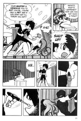 His use of blacks to balance out a page or to draw attention to story telling points are great. And his storytelling flow is at it's finest in this series. Look over to the left. Panel 7, here is great, as it does 2 things. One, it breaks it's borders, giving the gun draw a more agressive, violent action. And two, it goes right into panel 8 and into the man's mouth, emphasizing his anger and intent to shoot the poor girl. Then just for kicks let's go to panel 9 when he frames the man's white glove (with the gun of course!) with his own shadow, striking the highest contrast to the focus of the panel and furthering the point of the sequence.
Okay, soak it in and now let's move on to another page. Here's a technique he uses that we don't see so much in comic books nowadays. He depicts emotion, feeling and sound, as an image, In this page on the right. A young boy is playing a musical instrument for the Phoenix. Instead of having a narrator or an outside listener cue us in that the music sounded "beautiful, full of
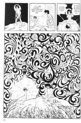 texture and melodic..." well Tezuka DRAWS it! And the effect becomes more powerful than the written word. Our imagination fills in the blanks and the mood of the story isn't bogged down by our 'hearing' a narrator tell us it sounded beautiful. Our brain fills in what it may have sounded like through the visual cue. Tezuka also chooses a big panel to depict this in. Giving that event serious importance as well as making the instrument's sound a whole lot more... grandiose.
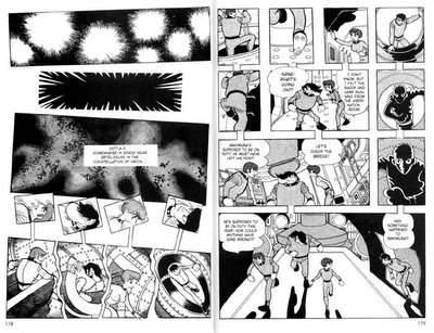
 Now I'm just gonna flood you with some absolutely stunning panel layouts. These can be found in volume 3 of Phoenix. This first one (below this paragraph) is the at the beginning of the story, where the crew emerges from their deep sleep. What Tezuka does is he 'breaks' general comic book reading flow by having each individuals' panel sequence be laid out vertically. But for us since the reader is used to reading left to right (or right to left as in it's original form) we're getting a slice of all these sequences, from different points of views happenning at once. We have a pretty omnipresent view of the whole crew as they emerge from separate compartments and MEET in one space towards the bottom. Hard to explain in words, better to just read it! Go ahead! Click on it! It looks good big too!
When I first saw this sequence, I cried. Okay not really, but I cried on the inside! Absolutely amazing stuff. Simply done, and done all throughout and pushing the story forward by doing this. It's Tezuka absolutely show-timing it. And it's stunning.
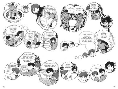
Here's another page where he starts using 'reader flow' to his advantage. This sequence is basically set up to give the reader a 'group memory' of a character that the crew is reminiscing about. Instead of showcasing the memories one by one sequentially, Tezuka throws all the thoughts together and gives us a big view. It's also great how he has a little picture of who's having which thought on the character, and 'seeing' it from their point of view. Great stuff. Wish I did it!
And that's it for me for today! Tezuka is the man! Till next time, Adeeeyos, God Bless and Merry Christmas!

2 comments:
This is so fascinating. I have to check this out (i.e. borrow your copy). More insightful reviews like this, please. Is that your new year's resolution? It better be...
I definitely am hoping to do more 'sequential art' dissection like this, and share my excitement for the good stuff! Rest assured when I come across more, I'll be blogging it up! I think I also want to do stuff where some comic book sequences DON'T work too...
Post a Comment